Designing a logo for the gated community
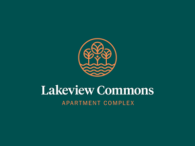
🏡Lakeview Commons is a small gated child-friendly community. We wanted their logo to show natural elements - trees and water, and children's play. The main shape that's repeated throughout is the circle, chosen as the perfect shape, symbolizing completeness, calm, safety, and trust.
Common is a synonym for the park in the UK, so earthy natural tones were the main inspiration for the color palette. We chose muted shades of orange and green. Combining the emblem with the wordmark of the name in strong serif font rounded our idea for this logo.
What do you think about this combination? 💚
View all tags
Posted on
May 13, 2020
More by moye_dsgn View profile
Like


