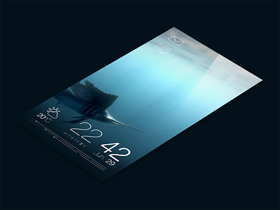
Jolla : Sailfish OS - Redesign - Part 2 - Icons

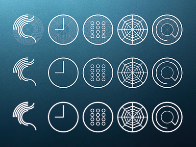
In the continuing part of my personal project where I'm redesigning the Jolla Sailfish OS, I've focused on the icons.
I made a drastically change from todays icons, because I want the icons to follow the same style and geometrics as the beautiful Sailfish OS logo. Furthermore, I believe that the icons need to look more like the overall UI of the Sailfish OS.
By these two reasons, I decided to go with an minimalistic and outlined design, where a discrete glow gives them that underwater feeling and signaling that you can interact with them. (And yes, colors can be added to differentiate them more from each other).
In my next step, I will redesign the home/main screen of the OS.
All feedback is welcome! :)
Also: Best viewed at @2x
And thanks to the Jolla community for the positive response to my little redesign project!