Find designers
Designer search
Quickly find your next designer
Post a job
The #1 job board for design talent
Inspiration
Courses
UX Diploma
Learn UX design from scratch in 6 months
UI Certificate
12-week UI skill building for designers
Live interactive workshops
with design professionals
Jobs
Go Pro
Log in
Dribbble: the community for graphic design
Advance your career with a Professional Diploma in UX Design
Learn more
Log in
Sign up
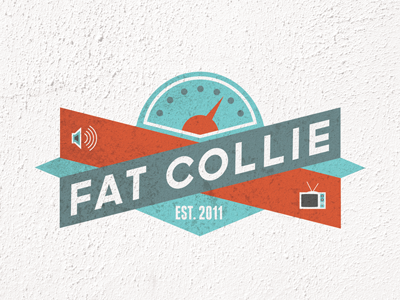
Fat Collie
Riley Cran
Follow
Following
Like
#F5F3F2
#D05737
#667878
#6C9092
#77C7C8
#73BFC0
#A5BDBC
#BC5A41
Download color palette
A logo for an Audio/Visual Production house.
audio
blue
custom lettering
icon
kill things and eat them
logo
logotype
orange
rabbit ears
scale
speaker
television
texture
tv
type
video
wall
View all tags
Posted on Feb 10, 2011
9,941
13
173
10
View feedback
Riley Cran
Typeface Designer
More by Riley Cran
View profile
Previous
Next
Loading…