Hero Section & Emergency Banner for nols.edu


Here is the emergency banner and hero section our team came up with for nols.edu.
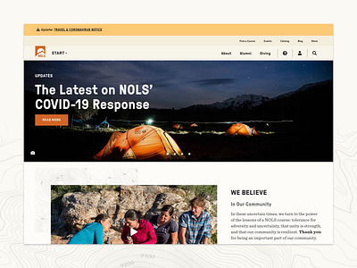
As a leader in the risk management industry, NOLS teaches the importance of assessing and communicating decisions and actions. During emergency situations communication is crucial. NOLS utilizes an emergency banner and a dynamic hero section to communicate important information to customers.
Emergency information should always be readily available. DO let emergency banners 1) stand out and 2) appear on every page of a website. DON'T let emergency banners 1) prevent a user from completing a task nor 2) be dismissed by the user.
An alternative to an emergency banner is a pop-up window. However, I am hesitant to use pop-ups; many people have pop-up blockers installed on their browsers to limit advertisements. In addition, pop-ups are often dismissed by users without being read. If I do need to use a pop-up I want to make sure it is accessible.
How do you communicate with your customers during an emergency? Do you have a preferred method to display important information on your website? As a customer, how do you prefer to be communicated with? What do you think is most effective?
I wish you all wellbeing and safety during this time.
👩My Role: Project Manager & User Experience Lead
🙌Shout-out to team members: Kristen Lovelace, Laura Griffee
💖 Press L to show some love


