CENIE stationery

The branding of the International Centre on Ageing (CENIE) had the mission of consolidating the brand as a centre of international excellence for research and innovation through leadership, knowledge generation and analysis.
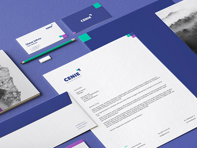
CENIE had to be a modern brand with a modern personality. We work with the concepts of progress and evolution, suggesting a a brand imagotype. The icon is an arrow formed by 3 squares symbolizing the 3 biological ages. The orientation of the arrow are impulse and change driver
The colour range (blue, green and magenta) means security, innovation, development and reflection, key concepts of CENIE's identity.


