2homes branding - product visual language

I feel like it’s time to start the spring cleaning the design cases backlog.
(My backlog is like a black hole!
Do you feel the same? You just finished a cool project. Then the new comes in. You add an item on the cases-to-show list. You finish that new one. And then realise it is a loop! And that “the time will come…”
So the time is now. We all at home. What else as not the spring cleaning?)
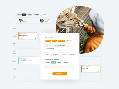
2homes is a Norwegian digital product for separated families that makes co-parenting easier.
My role (as a part of Chimera Prime team who developed the web and mobile apps) was to clarify their brand values to create brand identity and the product visual language.
Because in most of cases the family separation leaves scars on both parents causing them to avoid the communication, it was the imperative for me to create the visual language that will bring the most important part of the family life - the love and care about kids - to the very first place of visual perception.
Today showing the UI part - adding calendar.
More is coming soon :)


