Mac App Store Edited

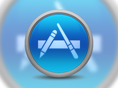
Playing around with the icon a bit more. I followed some of the critique, but I like how the glyph looks. I'm going to start working on resizing the icon for each size to get ready for a release.
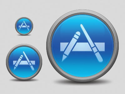
Playing around with the icon a bit more. I followed some of the critique, but I like how the glyph looks. I'm going to start working on resizing the icon for each size to get ready for a release.


