tried several variations and this was the best one. When the are all connected or become one color it looks funky. Even two colors on top of each other look a little strange. This is a really rough comp, it's a 5 minute hatchet job.
I was inspired by Michael's rebound and put this together. It's probably too abstract to be practical, but was fun experimenting with the shapes and symmetry.
15 Responses
Pro
Alex Pankratov
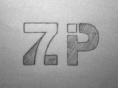
An awesome data compressor should really have an awesome compressed logo, don't you think? Go on then, rebound.
over 1 year ago
Pro
Milosz Klimek
Cool sketch & concept Alex, it will look great vectorized.
over 1 year ago
Looks great.
over 1 year ago
Pro
Nitish (Maskon)
can all the elements come together and form a better structure? like wr its going.:)
over 1 year ago
Absolutely adore this concept :)
over 1 year ago
Pro
Alex Pankratov
Thanks, fellas.
over 1 year ago
Rebound
7pzip Logo
by Court Kizer
tried several variations and this was the best one. When the are all connected or become one color it looks funky. Even two colors on top of each other look a little strange. This is a really rough comp, it's a 5 minute hatchet job.
over 1 year ago
Nice pencil work and logo!
over 1 year ago
Alex, the 7/Z idea is sweet!
over 1 year ago
Rebound
7ZIP
by Michael Spitz
Zipped ;)
over 1 year ago
Rebound
7zip
by Kyle Ruane
I was inspired by Michael's rebound and put this together. It's probably too abstract to be practical, but was fun experimenting with the shapes and symmetry.
over 1 year ago
Rebound
7[zi]P
by Christopher Konecnik
Not too different from the original, but I wanted to see how close to the original I could get without any shading.
over 1 year ago
Rebound
7zip revised
by Alex Pankratov
A different take on the I-P. Also an exercise in gradients.
over 1 year ago
Rebound
7z
by Alex Pankratov
7 and Z are just made for each other :-)
over 1 year ago
Love it!
about 1 year ago