Lettufresh

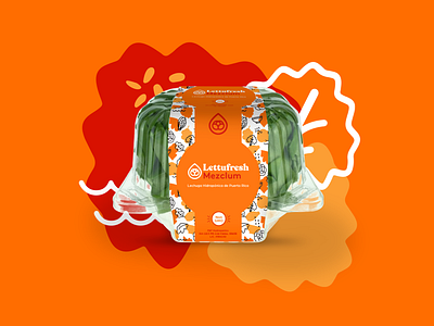


We had a minimalist approach to express nature, delicacy, and quality on this new brand identity created for Lettufresh. The icon consists of a lettuce ball inside a drop of water. That way we grouped the two main concepts of the brand: lettuce and hydroponic system. A bold serif typeface was used to start a joyful play with the identity. The main brand´s color is pink. It is a great way of expressing fun, showing innovation and targeting women. The patterns are hand style sketched to project the joy of eating something, that aside from being healthy, is just simply amazing. The brand architecture keeps this colorful, playful and striking design. Colors like bright green, blue and orange stand out to the human eye in a conservative industry where everything tends to be light and subtle.


