Japantown Branding


A group of local SLC designers were randomly assigned various neighborhoods of Salt Lake City to brand.
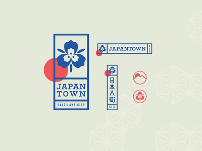
Drawing inspiration from the Hanko stamp that is used throughout Japanese culture from signing artworks to legal documents, the logo lock-ups are laid out to resemble these stamps. Both vertical and horizontal layouts were important as both are used in the Japanese language.
Use of the red circle is important on every logo mark. Sun imagery is often depicted in Japanese art and represents tradition and good fortune.
The imagery also drew on traditional Japanese icons like the cherry blossom and Mount Fuji, but was changed to encompass Salt Lake/Utahn icons, seen in the Sego Lily & Mount Olympus marks.
As patterning is a large part of Japanese art, I created patterns to be used throughout the branding that embody the characteristics wished for the Japanese community of Salt Lake City.


