Corona COVID-19 Dashboard


Every day I look at the COVID-19 Dashboard of the Robert Koch Institute (Germany's central scientific institution in the field of biomedicine, see attachment) and hope that the numbers will improve. Unfortunately we haven't flattened the curve enough yet. Stay home and healthy!
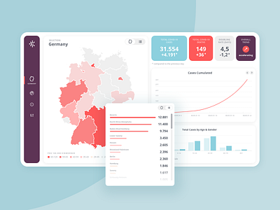
I have redesigned the dashboard and made some changes. The main changes are:
- I added a switch between map view and list of regions
- Additional display of the doubling rate and the general trend: This way you can immediately see whether the propagation is getting faster or slower.
- Curve of cumulated cases is preselected. (I find this representation easiest to understand, because this is the curve we want to flatten.)


