Ashland Botanical Branding & Package Design

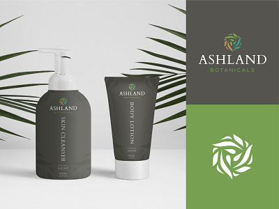
Ashland Botanicals came to us with the vision of a brand that brings calm and elegance to the CBD market. Our approach was to take the therapeutic nature of the Ashland spas and bring that experience to this CBD brand.
The typeface brings forth a sense of trust and elegance, while the color scheme reflects the harmony between earth, life, and water in the Ashland community. The mark demonstrates the interconnectedness of these elements.
The background color represents the relaxing sensation of a stone massage. The goal was not to scream hemp, but to convey an approachable product that uses hemp in a therapeutic manner.
Thanks for checking out this project!


