Flywheel Logo Round 2

Shot_1296504737

15 Responses

  1. Pro Jarad Johnson Jarad Johnson

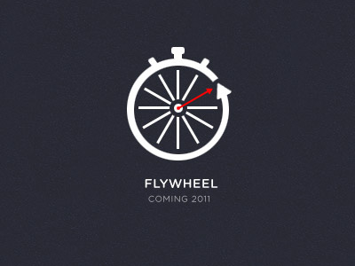
    This is much closer to the look I was wanting to establish. Flywheel is an iPhone app that replaces the coach in Spinning lessons. The concept is obviously combining a stopwatch, representing the fast paced timed sessions, with a bike tire.

    Would love to hear your thoughts, tips and rather or not it's snowing where you're out.

    likes

    over 2 years ago

  2. Jonas Pelzer Jonas Pelzer

    That's a very good logo, I really like it! Oh, and it's not snowing.

    likes

    over 2 years ago

  3. Dan Spencer Dan Spencer

    Nice start, but... I think you should kill the red second hand, flip the outside arrow around (Clockwise). They way you have it now it looks like your building a "travel back in time" app.

    likes

    over 2 years ago

  4. Ryan Burrell Ryan Burrell

    I think this is working well, overall. The spokes seem out of place, though I can't put my finger on why. Maybe change the arrow's thickness to match the spokes, or vice versa? Nice concept, less roulette wheel-ish than the previous attempt.

    Is that Quicksand, or maybe a Miso variant you're using for the font below?

    over 2 years ago

  5. Pro Jarad Johnson Jarad Johnson

    Dan — Great idea. Will definitely incorporate that in the next version.

    Ryan — I rather enjoy the contrast the thinner arrow brings to the logo, but I think I see what you're saying. Might be able to bring better balance when I switch the arrow as well. The font is Gotham Rounded.

    Luckily I know it's about ready to snow like a motherfucker where you're at, so it's okay you didn't answer :)

    over 2 years ago

  6. Ryan Burrell Ryan Burrell

    Right you are. Sounds like it might come down to having to eat the neighbor's dogs... or the neighbors.

    Contrast works, but if you're going that route I'd make the differences more pronounced. Dan had a good point about the outside arrow direction going counter-clockwise. I'd disagree about killing the red second hand since the color is a nice addition - I don't think it detracts from the design at all. Even in B&W it still adds to the message without making it too confusing, in my humble opinion.

    over 2 years ago

  7. John Mark Herskind John Mark Herskind

    Love this!

    over 2 years ago

  8. Pro Kyle Anthony Miller Kyle Anthony Miller

    This is real nice, man.

    over 2 years ago

  9. Pro Jarad Johnson Jarad Johnson

    Thanks guys.

    over 2 years ago

  10. Steven Schroeder Steven Schroeder

    In reply to what Dan said, when I saw it at first I thought the arrow should be going in the other direction as well, But when thinking it's a bike tire, the arrow would make sense for which way the tire would be spinning (Idk if you mean that or not) but it looks great either way.

    over 2 years ago

  11. Pro Jarad Johnson Jarad Johnson

    Thanks for the input Steven. Depending on which side of the bike you're standing on, it either spins clockwise or counter clockwise. However, I see Dan's point that the arrow currently looks like it's going back in time rather than forward, which may be an issue.

    Still weighing both options before sending out the final version.

    over 2 years ago

  12. Steven Schroeder Steven Schroeder

    Yeah, I realize how stupid that comment was now. The final products looks really nice.

    likes

    over 2 years ago

  13. Pro Jarad Johnson Jarad Johnson

    Ha, no worries, I did the exact same thing. Thanks man, appreciate it!

    over 2 years ago

  14. Joe Prince Joe Prince

    This is hot man!

    about 2 years ago

  15. Pro Jarad Johnson Jarad Johnson

    Thanks Joe!

    about 2 years ago

keyboard shortcuts: previous shot next shot L or F like