Book cover redesign - Advanced Korean grammar

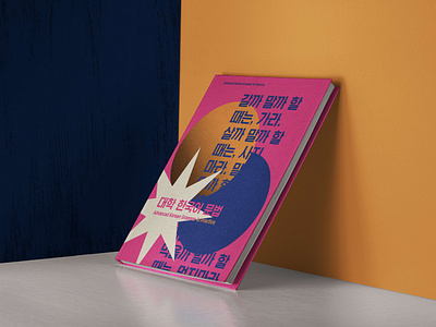
I decided to redesign the cover for a grammar book I was using during my university studies. The previous design wasn't very eye catching, and I felt I wouldn't pick it up if I were looking for new books as it seemed a bit old-fashioned.
So, I used some bright colours to make the cover more impactful. The original book features a blue-and-orange cover and pink on the inside, so I went with the same colour scheme, just brighter and stronger.
To make the cover appear more related to language studies, I used a quote that sounds kind of like a tongue twister. This way I was also able to create some texture to the otherwise flat vector design.
This was a fun little personal exercise, and I'm thinking of maybe doing some of the inner pages as well. :)
Thanks for viewing!


