Settings


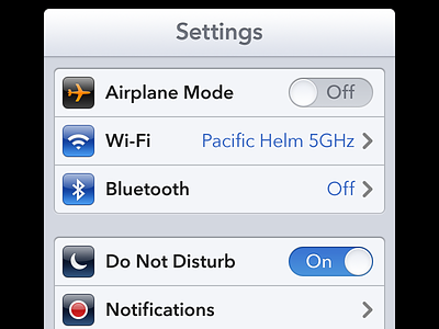
It's been a while since the original was posted, but since I wasn't happy with some things about it and had some time to play around, I ended up making my own take. Here's the full shot.
I, by no means, pretend this to be better than anything or "the way iOS 7 should look". It's just my personal take of a shot made for fun. Call it an exercise or a test. That's it.
Font: I went for a lighter approach. To be honest, I'm a bit tired of iOS' "boldness everywhere", so I used Medium instead of Bold and Light instead of Regular. IMHO, it feels much better and matches this less-recharged-style so much more.
Nav bar: Maintaining the actual rounded corners and font size. Cleaner, I think.
Grouped Table Views: Sharper, subtler edges and cell separators.
On/Off Toggles: I made them slightly narrower and tried to keep some of the essence of the actual iOS ones.
Chevrons: Smaller, thinner and lighter, as I don't want them to drive that much attention, plus I think they fit the less bolder font better this way.
Icons: I wouldn't dare to touch these, so I kept the ones Louie made, although I really hope Apple gets rid of the gloss once and for all.
Cheers :)