Riders Brew Co. – Rebrand, Logo


For the last few months, I've been working with Melbourne based brewery, Riders Brew Co., on a brand update. Their first update since they started brewing in 2014!
The guys behind Riders Brew Co. are avid surfers, mountain bikers, horse riders, skateboarders and rock guitarists.
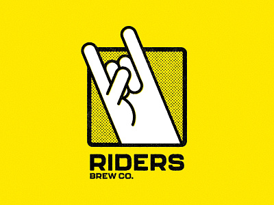
There's a lot to try and capture there, but we worked through a number of concepts - some fairly safe, some a little more out there - and this was the design that we ended up developing. The inspiration came from old punk rock show flyers, and the 80's skate and surf scene.
With ambiguous branding and can art becoming more common within the craft beer scene, I wanted to go the other way, and give the client a simple, bold and structured brand identity, that they can own, starting with the "devil horn" icon.
As far as audience goes, we really wanted to appeal to craft beer nerds, like myself, who value provenance, independence, and great ingredients. On the other hand, we're trying to capture those consumers who consider themselves craft fans, but buy at the bigger liquor chains, and aren't as concerned about who owns the brand - it's really more about getting cut-through on the shelf, and grabbing those potential new customers in a very competitive, visually driven sector.


