Dashboard UI Design - HCI


Hello Dribbblers!
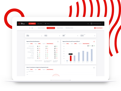
This one I made for a major client. They had a big database for presenting it to the users and there were more than 30k data points which needed to be displayed.
The client wanted to present these data points in a most readable way.
I came up with this. Check out the attachments.
Let me know how we can improve the readability and scanning for the entry points while keeping the UI aesthetic.
Hit 'Like' if you love it, or save it.
Sayonara


