Credit Card Checkout Form

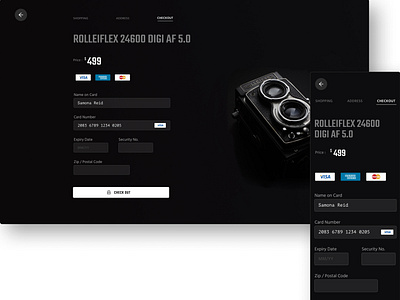
I designed this credit card checkout page after looking at certain best practices for credit card Forms. If you disagree with my design or have any feedback do let me know !
This is what I found :
- For form fields in general it is better to have the field labels at the top.This ensure that the experience works well on mobile as well.
- Be sure to mention the kind of cards accepted.
- Try to define the field length based on the input for certain values that tend to be of standard length like zipcode, and security code.
- Adding a lock icon to the checkout button especially in the case of expensive transactions helps reinforce security.


