Find designers
Designer search
Quickly find your next designer
Post a job
The #1 job board for design talent
Inspiration
Courses
UX Diploma
Learn UX design from scratch in 6 months
UI Certificate
12-week UI skill building for designers
Live interactive workshops
with design professionals
Jobs
Go Pro
Log in
Dribbble: the community for graphic design
Log in
Sign up
Unused Re-design
Sarah Parmenter
Follow
Following
Like
#34ADD0
#51CBE3
#F2F6F8
#AAD2DD
#7E806B
#C83C30
Download color palette
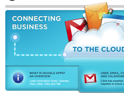
An unused design for a large technology company homepage.
airball
blue
rejected
View all tags
Posted on Nov 12, 2009
2,491
1
51
17
View feedback
Sarah Parmenter
More by Sarah Parmenter
View profile
Previous
Next
Loading…