36 Days of Type, D


36 DOT, D
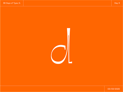
Worked on this one on my break yesterday. I wanted to have some fun with a funky serif. I've seen a lot of typefaces nowadays with very high contrast forms. I wanted to explore this idea while creating this D.
I love the tension between the small gap in the stem, as well as the contrast between thick and think within the eye.
What do you think of this D? I think it would be an interesting typeface.
Click "L" if you like it!
& leave feedback, it's always appreciated!


