


Skeu-less Reminders.app, take 2

I designed yesterday's http://dribbble.com/shots/1057583-skeu-less-Reminders-app so that it looks somewhat like the actual app, just without those pesky textures.
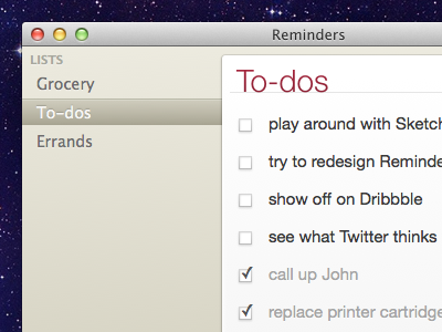
But when you think about it, the dark grey border around the todo list is still reminiscent of the original faux leather texture. It just doesn't fit here.
So this time, the idea was to design something that would actually look like OS X. The good ol' OS X, not the one crippled by skeuomorphic ideas :) But I still wanted to add something new. And so I used native window frame and ML-style sidebar, but I didn't use blue, and the main content is in a "card" above the background (instead of just separated from the sidebar with a thin line). I admit I was somewhat inspired by http://basecamp.com ;)
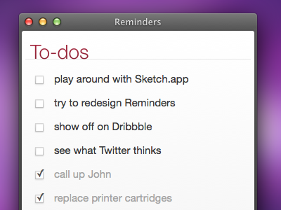
Full screenshot: http://radexp.pl/1/reminders.png


