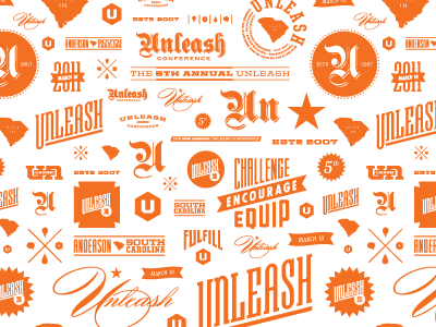
Making a repeating pattern gives my design brain a workout. Now to make it feel more random and less cramped.