Urban Outfitters: Logo Expansion

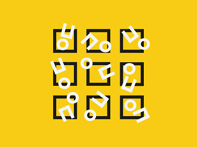
This is an unofficial rebrand for Urban Outfitters, focused around being bold, bright, expressive and breaking boundaries. The logo is a "U/O" for Urban Outfitters, and is also an exclamation mark to show expression. I focused on using a vibrant, street-esque yellow, black and white colour scheme and very bold, modern type to keep the brand both recognisable, coherent and attractive. It also leaves room to expand the brand across any touchpoint necessary, using these colours, type and language.
full project: https://bradmead.com/urban