Bank Dashboard

Who says graphs are boring? They just need a little color and a good UX behind them :)
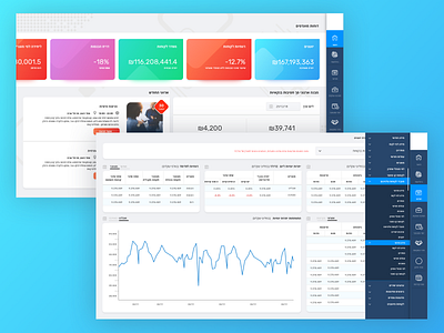
Bank Hapoalim in-organization dashboard, implemented with Power BI
Who says graphs are boring? They just need a little color and a good UX behind them :)
Bank Hapoalim in-organization dashboard, implemented with Power BI


