Should I make it happen (aka Portfolio redesign 2013) ?
Everyone seem to be obsessed with designing / redesigning portfolio websites lately. So I thought I'd share mine.
I designed it back in October 2012 when I had a few hours a day to kill. It was the time when I purchased a sweet domain name and I wanted to create a facelit for it. I even coded cool interaction for the inphographics with raphael.js but well then other things got carried me away!
I was after clean interface with lots of white space and cool interactions. I wanted to add a bit of "interface"-like feel to it, but at the same time stay super clean. No long descriptions of epic life, nothing to distract the user but to give him an idea of what type of work I perform and showcase it by what I had done for my portfolio site.
Bacially the features I was after are:
✔ clean layout
✔ geometric forms
✔ limited number of colors, greys mostly so the content stands out
✔ smooth interactions
✔ clean typography
✔ a very limited "personal touch"
Numbers are obviously changed since then.
♫ Top right shape I was considering as a base for my logo.
Well of course I never 100% happy with the design for myself (who is?) but what do you guys think of that one? Should I make it happen?
I know it doesn't look like most of portfolio websites out there but I'm curious on what you think.
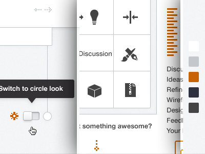
I attach full pixels too with couple of notes (for myself, would not be present on live site). And the color scheme, you can also see it in context down the layout on full view.
Note: One type of infographics is supposed to be displayed at a time - either shape or circle. I'm showing both at once here.
***
♥,
@julia


