i really enjoy the box with the tabs, however, the location of the 'x' on the tabs kind of bother me. maybe it needs a small circle around it so i can cross over top of the tabs? i'm not sure. i admire your work. keep on doing what you do.
@Jonno Riekwel what's funny is that the person first posted it without the red arrow explanation and that people didn't saw it. So he or she had to add that extra info. Says enough.
BTW, I actually showed the client and he didn't care about it.
10 Responses
Pro
Veerle Pieters
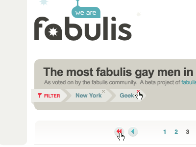
If all goes well, a limited, early beta version of the site will be launched tomorrow (snapshot taken from Photoshop).
about 2 years ago
Haha that's cool! Nice font too, is it premade or youmade? If premade, can I download somewhere? :3
Nice layout.
about 2 years ago
I like the shape of the keywords and the colours are very smooth and warm.
about 2 years ago
Pro
Jonno Riekwel
Is it me or does the 'star' in the a look like an anus?
about 2 years ago
@Jonno I always knew you had the biggest imagination of everyone!:-P
I like the design btw!
about 2 years ago
Pro
Veerle Pieters
@Jonno Riekwel lol, you should get out more or you need glasses ;)
about 2 years ago
i really enjoy the box with the tabs, however, the location of the 'x' on the tabs kind of bother me. maybe it needs a small circle around it so i can cross over top of the tabs? i'm not sure. i admire your work. keep on doing what you do.
about 2 years ago
Pro
Jonno Riekwel
@Veerle You're right, I should get out more haha. Still great work though. Love the colors.
about 2 years ago
Pro
Jonno Riekwel
I swear I didn't do this: http://9gag.com/gag/20042/
about 2 years ago
Pro
Veerle Pieters
@Jonno Riekwel what's funny is that the person first posted it without the red arrow explanation and that people didn't saw it. So he or she had to add that extra info. Says enough.
BTW, I actually showed the client and he didn't care about it.
about 2 years ago