Please note that on the design execution side of things, it's rough, preliminary work. Please reserve the "your edges are blurry", or "you're off a pixel" for subsequent iterations. Looking for some high level feedback on the conceptualization only at this point.
Mike, I like where this is going. My only comment would be to look at how the leaf might simplify in shape to stylistically fit with the other elements.
12 Responses
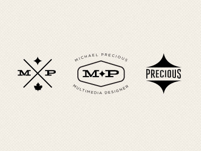
Elements being built into identity system.
Please note that on the design execution side of things, it's rough, preliminary work. Please reserve the "your edges are blurry", or "you're off a pixel" for subsequent iterations. Looking for some high level feedback on the conceptualization only at this point.
over 2 years ago
Mike, I like where this is going. My only comment would be to look at how the leaf might simplify in shape to stylistically fit with the other elements.
over 2 years ago
It makes me sick at how talented you are!
over 2 years ago
I like them all- especially the one on the far-right
over 2 years ago
@Joseph: good call on the leaf. I'll try and strip it down for the next round.
@Christian: thanks! Great to hear some encouraging words from colleagues. Stay in touch.
over 2 years ago
Really liking this set, especially the middle one. Can't wait to see where you take your brand on this go around!
over 2 years ago
Nice work! Also most into the middle one, though I'm not too sure about the name and tagline yet. They stil feel a bit alienated from the logo part.
over 2 years ago
middle one seems the most connected, would need to see everything in context to really have any kind of constructive feedback
over 2 years ago
Love all three. Great stuff here!
over 2 years ago
@Mike Wait... you're from Pittsburgh *and* Canada?
Nice work, man.
over 2 years ago
Very nice. Love the texture.
over 2 years ago
I loved the texture :)
over 1 year ago