Find designers
Designer search
Quickly find your next designer
Post a job
The #1 job board for design talent
Inspiration
Courses
UX Diploma
Learn UX design from scratch in 6 months
UI Certificate
12-week UI skill building for designers
Live interactive workshops
with design professionals
Jobs
Go Pro
Log in
Dribbble: the community for graphic design
Log in
Sign up
Admin User Options
Karmon French
Follow
Following
Like
#D8D8D8
#BFBFBF
#676767
#3F4042
Download color palette
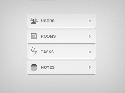
custom icons
gotham rounded
grey
icons
ui
web app
web application
View all tags
Posted on Jan 20, 2011
7,166
13
154
7
View feedback
Karmon French
More by Karmon French
View profile
Previous
Next
Loading…