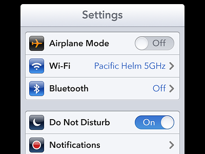
iOS 7 settings

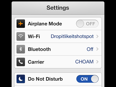
Tried my hand at an updated UI that could be used for iOS 7.
Wrote a post about my reasons and thoughts here - https://medium.com/thoughts-and-words/bb7bff4d8670
"Instead of the old ‘cut out’ blocks, a subtle card placed on top of the background layer (which itself has been simplifed).
Also, the characteristic gloss has been ditched to give a simpler and more subtle feel to the icons and the on/off switches.
Visual indicators which are almost semi-redundant such as the chevron have been backgrounded.
The nav bar has been smoothed out and, along with the shadowing, given a more subtle, crisp feel.
The main blue has been brought down to a classier, almost royal tone.
I also dropped a couple of cheeky ‘wishes’ in there; for multiple accounts on one phone and the possibility of widgets on the desktop."