Las Vegas Raiders Logo Concept

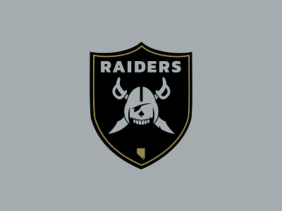
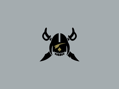

I spent some time recently redesigning a concept of the Raiders logo prior to their move to Las Vegas. I kept the general color theme that the Raiders have, but changed the gray slightly and added some gold accents for the Vegas destination.
The current Raiders logo has been around since about 1964, and in my opinion, is in dire need of a refresh. Keeping to the current, "old-school" theme, I brought back the old football helmet and swords, while making the face into a skull version. I tried to make the mark cleaner and more simple by removing all the small features in the face, swords, and helmet.
Let me know what you think! I'd love to hear your opinion on how I executed on the redesign concept!


