Find designers
Designer search
Quickly find your next designer
Post a job
The #1 job board for design talent
Inspiration
Courses
UX Diploma
Learn UX design from scratch in 6 months
UI Certificate
12-week UI skill building for designers
Live interactive workshops
with design professionals
Jobs
Go Pro
Log in
Dribbble: the community for graphic design
👀 BIG news from Dribbble...
check out our blog for details!
Log in
Sign up
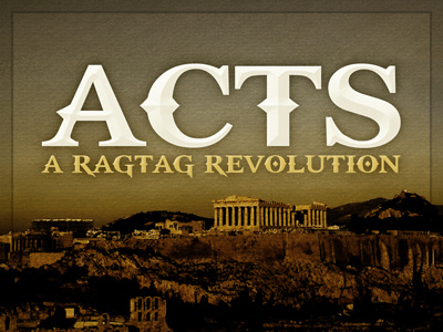
Acts Sermon Series
Jeff Nine
Follow
Following
Like
#6E6447
#120903
#50300E
#887340
#F2EFE1
#B6A059
#C6BD9C
Download color palette
Not sure if the background is too dark, or if I like the font. Thoughts?
acts
bible
church
ministry
series
sermon
View all tags
Posted on Jan 19, 2011
663
1
8
1
View feedback
Jeff Nine
More by Jeff Nine
View profile
Previous
Next
Loading…