For the Bees emblem ideation 1

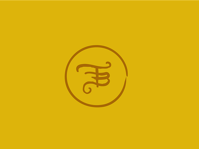
The first run at a For the Bees emblem/logotype. We got an F/T/B, as you can see. I liked that it felt cute, different, and fun. It almost reminded me of a gold doubloon which is certainly a different route from where most honey companies take their branding. I ended up designing the emblem with a bee in the shape of crystallized honey.
Goal: Use as a wax seal on the honey bottle's neck. Stamp on cloth bag. Gold debossed or spot-glossed on the back of the information card in the bag.


