Me-200x200

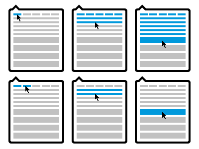
LittleIpsum Selection Menu

25 Responses

  1. Pro Me-200x200 Grant Hutchinson

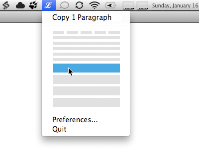
    I decided to mock up my concept for LittleIpsum’s proposed selection interface in situ. I am assuming that the existing menu items aren’t going anywhere.

    over 1 year ago

  2. Pro Mefacesface Alan Houser

    I like this allot better. I use it on every project, and while the current interface is unique, it's awkward to wait/pounce-on what I want.

    over 1 year ago

  3. Pro Nice_logo Stan Grinapol

    I did not get it earlier, this makes allot of sense, love the concept.

    over 1 year ago

  4. Pro Profile-small Seth Gerard

    I like it. Though not usually used with groups of same menu items, it might help to have the divider lines between each 'block' just so you can quickly scan how much text you're getting...maybe?

    over 1 year ago

  5. Cropped-hell-yeah Mark Otto

    Why not just use text labels instead?

    On the main dropdown, show the following options: Words, Sentences, and Paragraphs. Hovering over any one of those options would count up the numbers just like it does with the current UI. Seems like the text labels would be easier to quickly understand, making it easier to find the right option you want.

    Such a condensed group of lines is harder to discern compared to three distinct words. It'd take more time and effort to hover over the right block (and the right number of blocks) than I want to put into such a tool. At present, it's as easy as counting to 5 a few times—not so here.

    Adding menu options for Words, Sentences, and Paragraphs would improve that workflow by saving me at least 5 seconds every time I use the app.

    likes

    over 1 year ago

  6. Apple-touch-icon Luke Dorny

    It takes a second to wreck it, it takes time to build! -BBoys
    I like all of these concepts. Why not make it an option to do any of these?
    Also, a number 1-4 next to each graphic option might help alternatively.

    over 1 year ago

  7. Pro Mariehohner_profile_small Marie Hohner

    Makes good sense to me. I hope it get's implemented.

    over 1 year ago

  8. Pro Me-200x200 Grant Hutchinson

    @Seth Dividers are an interesting idea. Without having a working prototype, it’s hard to determine whether the user would need more delineation between that different blocks or larger targets. I’ll mock something up for that.

    @Mark See @alan’s comment and Dustin’s original video post.

    One of the reasons for moving to a more direct interaction with the representative ‘blocks’ is to eliminate the delay when waiting to “count up the numbers”. The spacing and target area of the blocks could be changed to increase the user’s success in hitting the right spot. I’d argue that this method would not “… take more time and effort to hover over the right block” than the current interface. It’s more like sliding quickly through a list of menu items.

    over 1 year ago

  9. Faruk-100x100

    The idea in this variant is that you drag across the bar and click to copy; while not as charming as Grant’s version, it doesn’t suffer from tiny clickable areas for the words and lines.

    over 1 year ago

  10. Me_park

    Proposing another interaction for the upcoming UI change to LittleIpsum.

    As you move your mouse downwards from the top menu the window expands and increases the amount of Latin generated upon click.

    Coloured blocks represent words, then sentences, then paragraphs.

    The light grey line represents the total distance the mouse would have to move to go from generating one word, to four paragraphs.

    This mock up skips stages (3 words, 3 sentences, 3 paragraphs) for illustrative purposes.

    Full Version: http://dl.dropbox.com/u/403968/ui_v1_littleipsum.png

    over 1 year ago

  11. Pro Profile-small Seth Gerard

    @dustin your concept is innovative for sure, but I feel like maybe it overcomplicates a really simple UI need.. I think Grant's design is elegantly simple, and provided the hit-areas work like you'd imagine they would, then this really hits the nail on the head.. quick scan, visually identify the approximate amount of text you need, click, you're done.

    over 1 year ago

  12. Pro Me-200x200 Grant Hutchinson

    It’s very hard to gauge how complex or simple the interaction will be without building a working prototype. Frankly, I’d love to be able to “time trial” my concept beside Dustin’s.

    over 1 year ago

  13. Pro Me-200x200 Grant Hutchinson

    Don’t miss Kyle Pickering’s “Feeling Lucky” rebound. Har.

    over 1 year ago

  14. Pro Me-200x200 Grant Hutchinson

    The handy Mr Senos has mocked up this menu concept using Flash and posted it to the LittleIpsum blog. Please give it a whirl and send him your feedback.

    over 1 year ago

  15. 2 Matthew Walton

    The only problem I see with this is that if you want words you have to move left to right but for paragraphs and sentences you go downwards. It's a clever idea though.

    over 1 year ago

  16. Pro Me-200x200 Grant Hutchinson

    Matt, did you give the interactive mockup a try? It’s not very difficult to get the feel of how the menu would work in practice.

    over 1 year ago

  17. Apple-touch-icon Luke Dorny

    I like it! If there's debate, i wouldn't mind seeing more ideas in mockup like that, but otherwise, I'd approve this idea. Nice job Dustin and Grant!

    over 1 year ago

  18. 2 Matthew Walton

    @Grant I did give it a try before my comment. The way I would adjust it is to make a downwards mouse movement gradually select the 1 - 5 words. So if you go straight down, it doesn't jump from 1 word to 1 sentence. I would also get rid of “Preferences” and “Quit’ at the bottom and have them accessible via right click, like Coversutra.

    I do like it though and don't mean to sound overly critical.

    over 1 year ago

  19. Apple-touch-icon Luke Dorny

    personally I can't stand requiring control/contextual clicks on the menubar. having prefs and quit below everything feels more comforting to me.

    over 1 year ago

  20. 2 Matthew Walton

    I guess it depends on the app really. With LittleIpsum it seems really pointless and a waste of space to display Quit and Preferences, when they will hardly ever be used. Apptivate does the same thing.

    over 1 year ago

  21. Pro Me-200x200 Grant Hutchinson

    @matt Menu items are not a “waste of space” if they are requisite and perform a needed (albeit irregular) function. Should Safari have it’s “Print…” menu item removed because the majority of people never print a web page? Probably not. By keeping those two menu items (which arguably do not get in the way of the primary functionality of LittleIpsum) you are keeping things as straightforward and obvious as possible.

    There will always be a need to manually quit the application and access the preferences. If these menu items did not exist in the menu itself, you would have to access the functionality via “option key on launch” or some other unintuitive means. The Coversutra method of accessing hidden functionality falls into this category.

    over 1 year ago

  22. 2 Matthew Walton

    But the Print function in Safari is appropriately relegated to a menu and is not in the main window of the app. LittleIpsum's main window is the menu or (pop-over). There are good arguments for leaving them there (ease of access/not hiding features), but I think there are also good arguments for relegating them. It simplifies the UI and means that you can click on the icon to select text, and only get the text selection menu. Or you can right click to get options, you only get displayed options.

    over 1 year ago

  23. Pro Me-200x200 Grant Hutchinson

    Ok, I have a better idea of what you were going for … I still think that key modifiers are not something you should introduce into a reasonably tidy UI, given the amount of secondary elements affected. Perhaps if the app had a dozen (or more) additional menu items.

    over 1 year ago

  24. 2 Matthew Walton

    I'd be interested to hear your thoughts on the animated mockup I posted? I tried to take on board your comments and make those features more accessible than they would be via right or ctrl click

    over 1 year ago

  25. Pro Me-200x200 Grant Hutchinson

    I left a comment, but forgot to link to it.

    Silly me.

    over 1 year ago

keyboard shortcuts: previous shot next shot L or F like