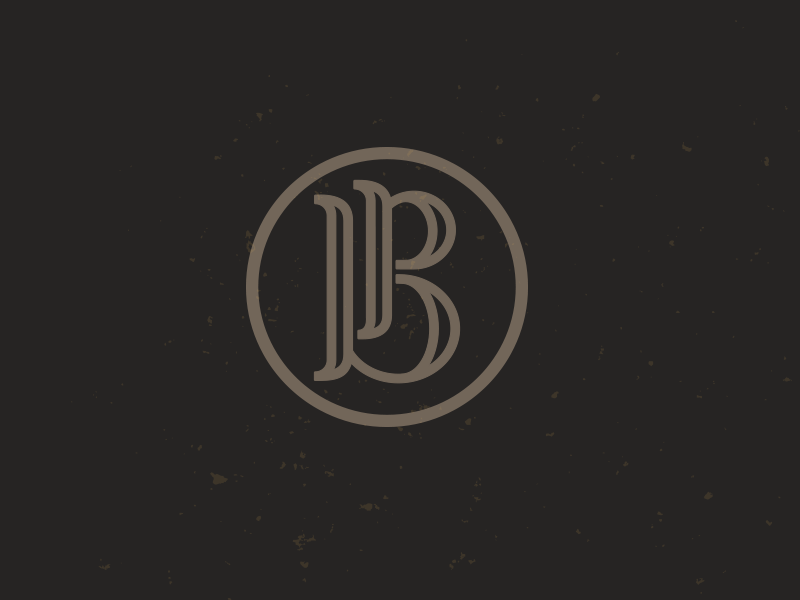
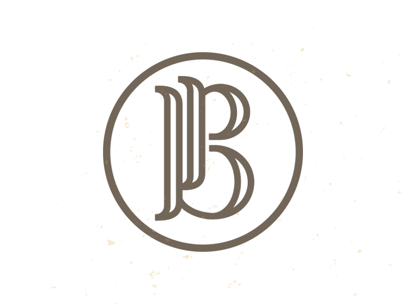
I noticed I never placed the final logo up here.
Pretty proud of my younger brother and his photography. He only does it as a hobby right now, but I think he's capturing some get shots.
His big advantage is he lives in Australia right no...
Client is leaning toward this design approach.
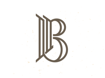
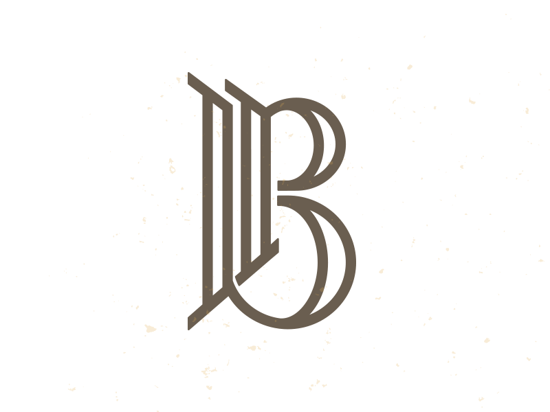
I moved the "p" over and changed up the "b" ever so slightly, but does it help separate the two letters a little better?
And still hold the capital "B"
Thanks.