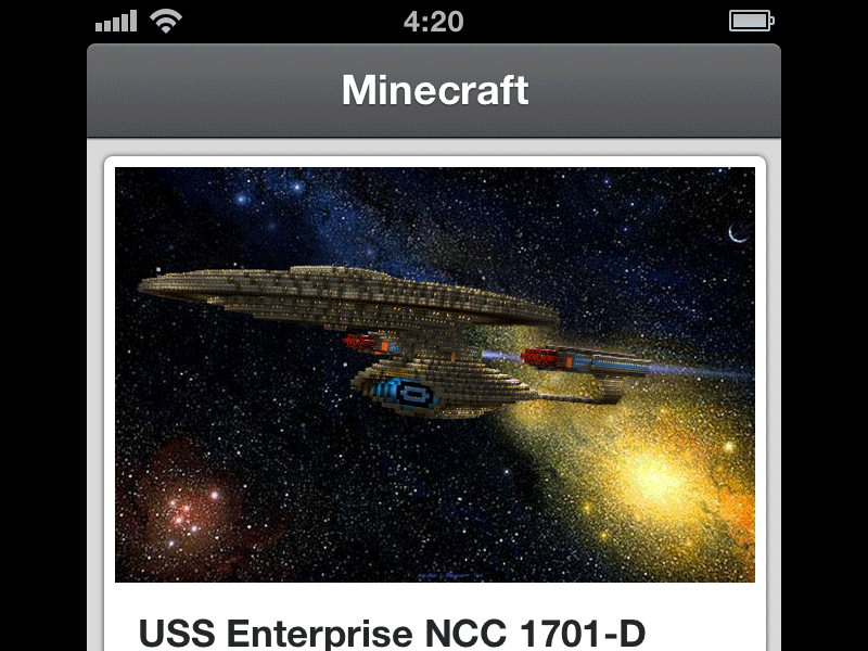
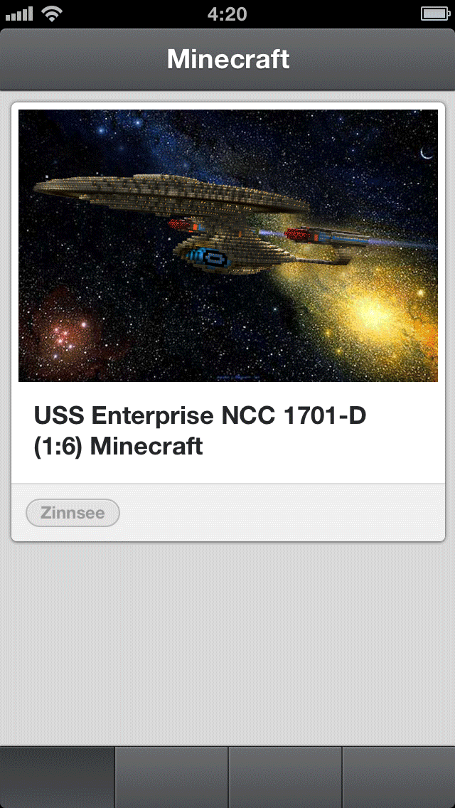
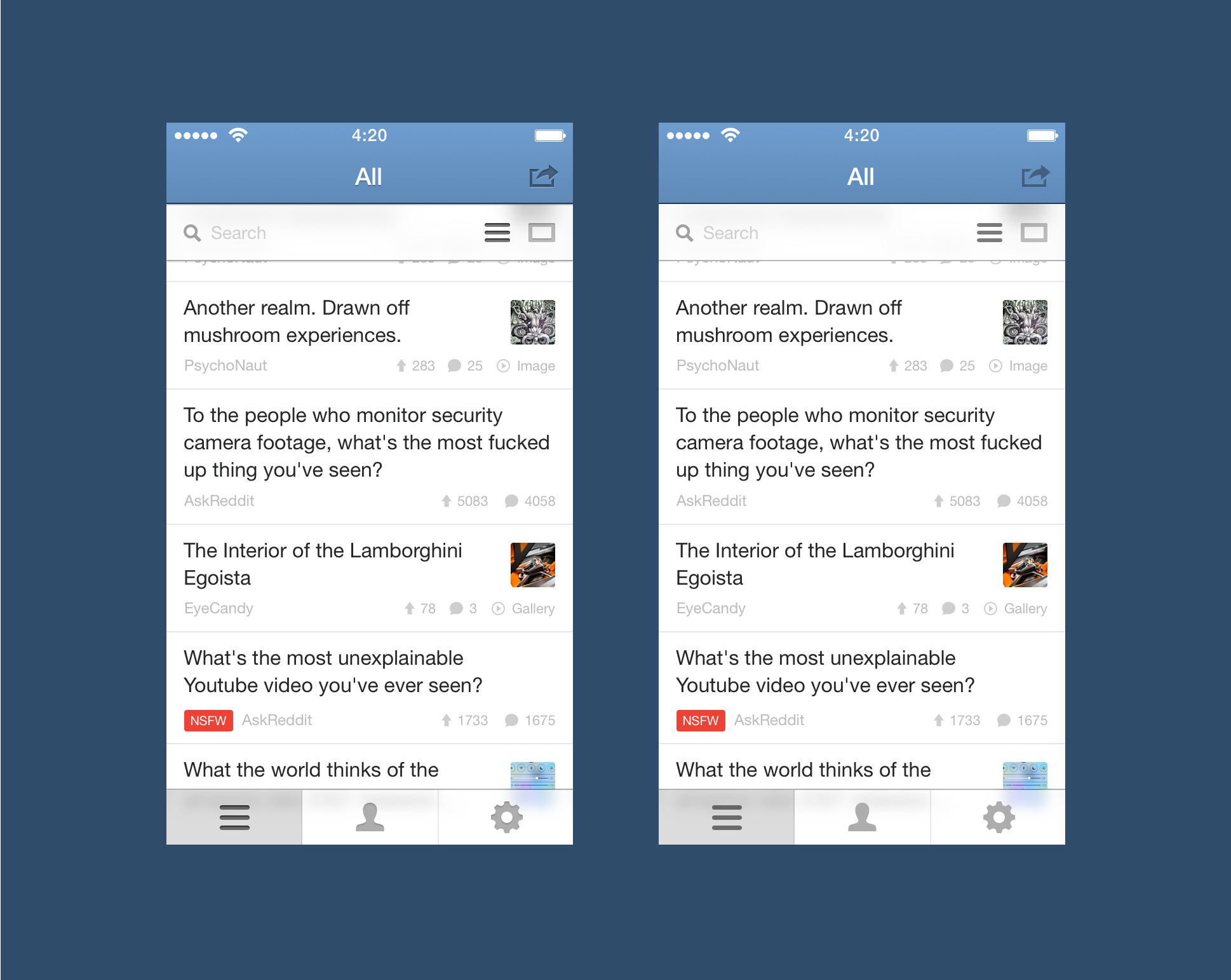
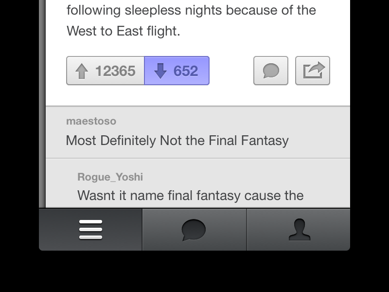
I've improved it a bit and I't starting to look better. I can get used to this.
I've attached a version with and without depth. Now VOTE. Left or right? With or without depth? Try it out on your phone.
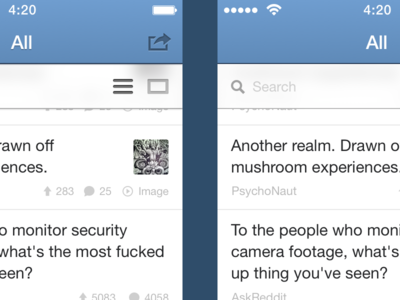
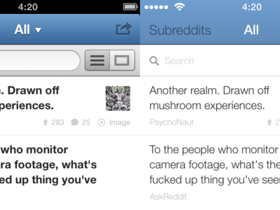
So I'm trying to port this design to iOS7… I think it's horrible. I'll have to find something in between with some smooth gradients and dropshadows for contrast.
But I'm wondering, what do people think of this design now? I'm really con...
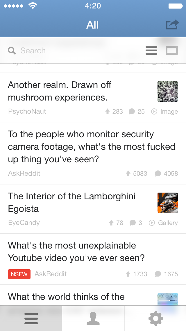
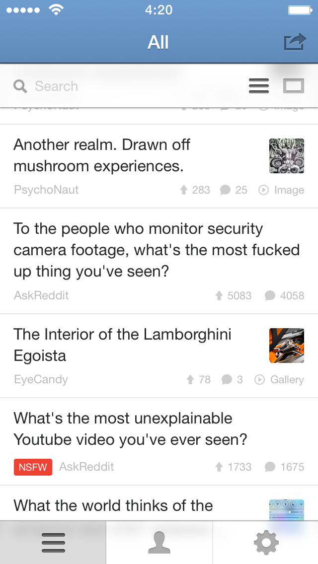
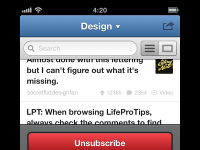
Working on search. I've made a similar switch like Tweetbot has. I love their idea and it's the perfect solution in this case.
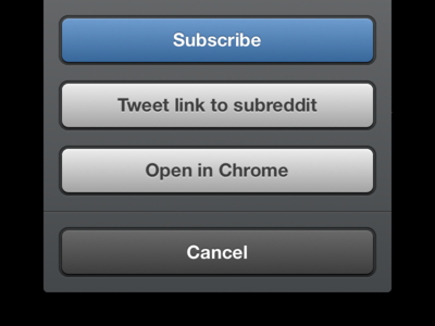
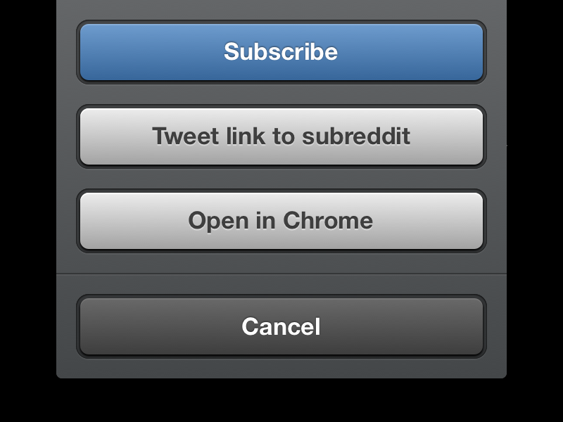
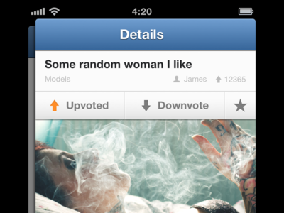
The unsubscribe button is the same action sheet from my previous shot, but a different state.