This runs a lot smoother in code than the gif shows (as expected, I suppose) but anyway, just experimenting with components for a redesign. SVG font, pseudo-selectors and CSS animations :)
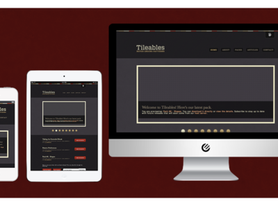
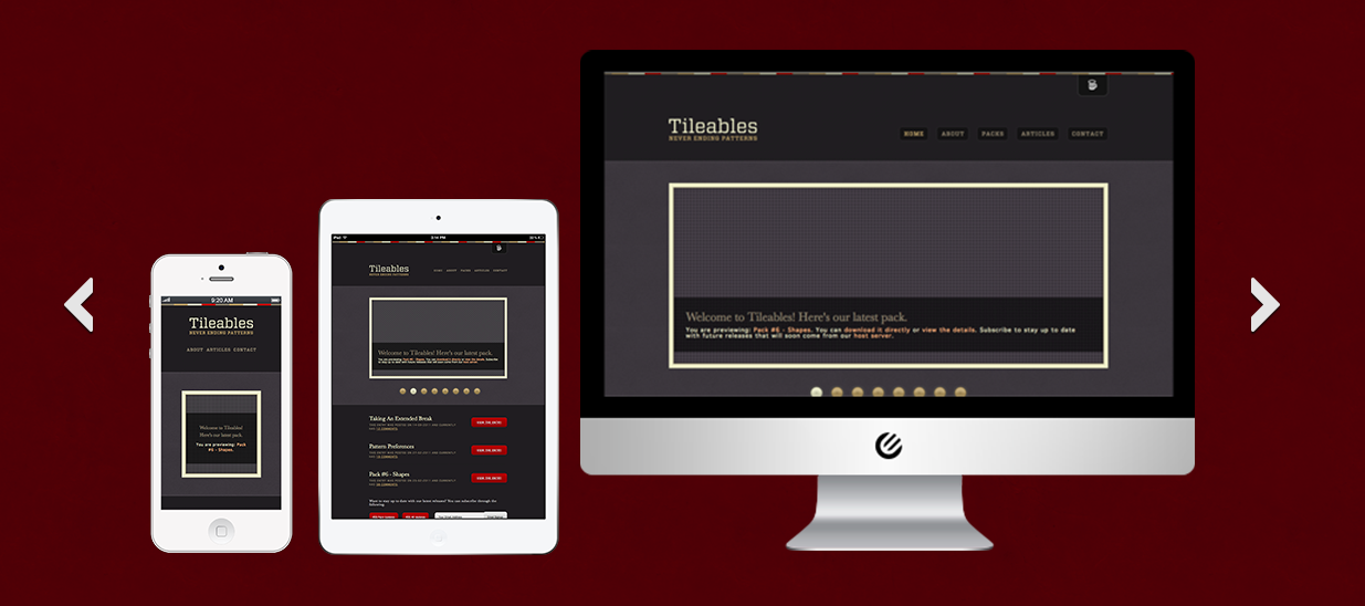
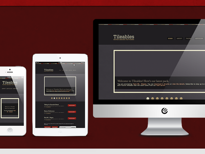
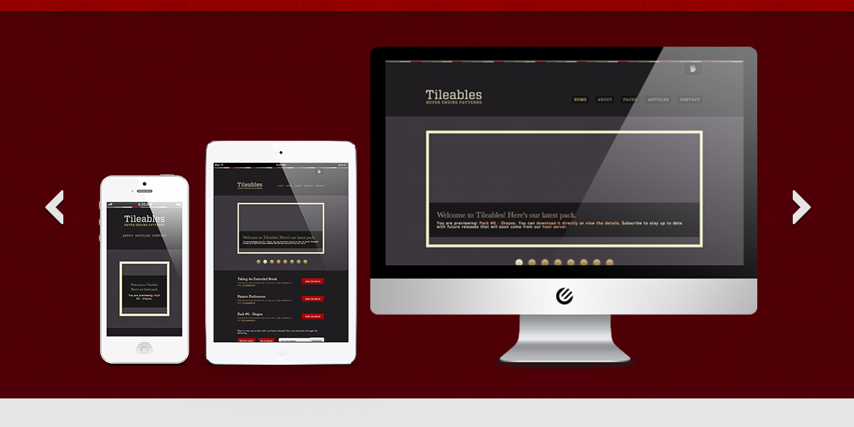
Working through the night and toying with display options for portfolio work. See attachment for a full size view of this carousel option. My alternative at the moment is some Enliven Labs branded browser windows, sized appropriately but...
Making a start on the long, long, long overdue portfolio overhaul. Much more than a simple redesign, this one will actually include some recent work on it!
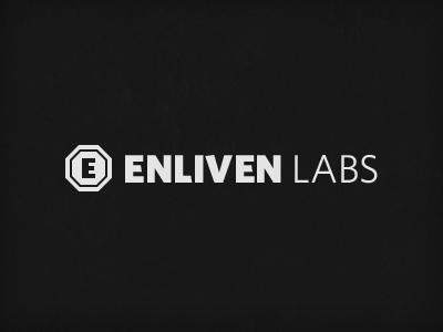
Just another quick idea I had for the icon and sketched it out before I forgot about it - mainly to revisit later if I like the direction. It make take a couple of glances at the icon but it should be apparent what I'm aiming for there. ...
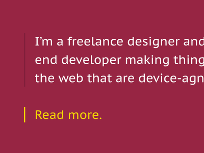
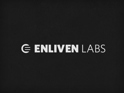
I'm liking this much more in terms of the text. I still like the idea of an icon/mark to go along with it but not sure this is the right direction for that. Better than the previous?
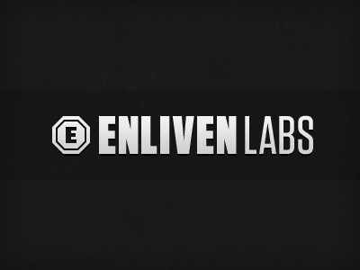
Experimenting with a completely new direction for a portfolio redesign. I'm wanting to rebrand at the same time. Early stages of the initial idea, just documenting it here. Avoiding the 'put a logo inside a circle' syndrome we're seeing ...