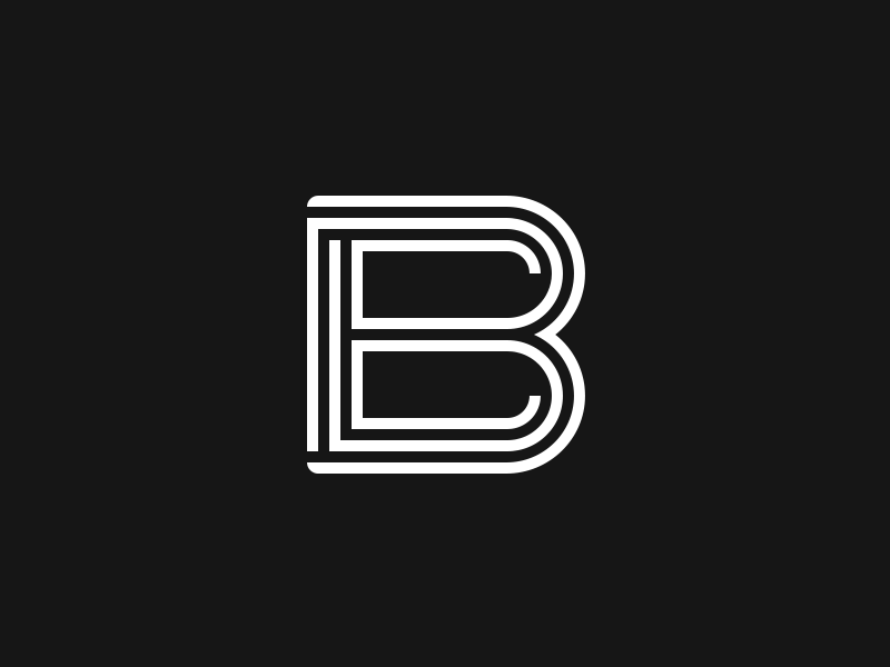
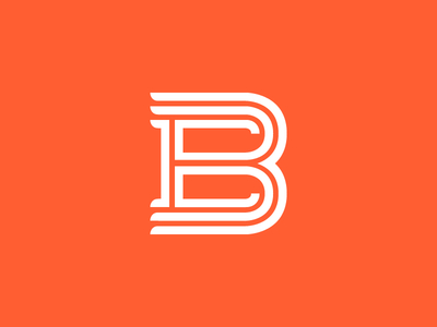
Here we are a year later with an update on my personal logo!
p.s. anyone know why my 200x150 view of this is blurry? I had to nudge this logo 2px to the right and down to get the 400x300 version to not blur, and I guess I messed some...
I did this for practice and thought I'd try my own take on it as well as an idea out on the "Q" the same time.
Every letter was made by me. I feel the "S" is a little off, what do you think?
Yeah, so, you all know how hard it is to design for yourself, let alone your logo. This has been stressing me out for a while, haha. I finally came up with something I like, only problem is I'm stuck between the two.
Which do you like b...