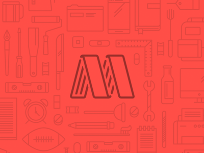
Another rejected branding piece!
A touch "rugged/aggro" for the brand positioning... Dug the general shape, but the type still needs work... (Think the M/A are a bit "saggy" and a touch too deco feeling) Font is a modified/tweaked "Fron...
Identity piece for a much larger project we're working thru for a client out of Seattle... Can't say much yet, but we're super excited to be able to share some more bits in the coming months.