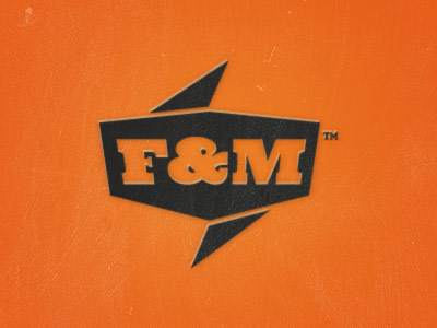
Apologies again for the grainy shot. Just another exploration... This time with type. Wanted something that felt "blue-collar" tough, supported the logo image, but still contemporary in its own right. Type type used in this proof is, "N...
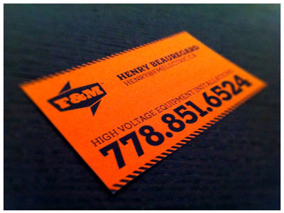
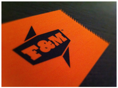
A quick & dirty application test for the F&M electric logo. Forgive the graininess, but that's what happens when you try to simulate fluoro stock with an inkjet! :) Playing with pushing the bold & colourful angle, while tryin...