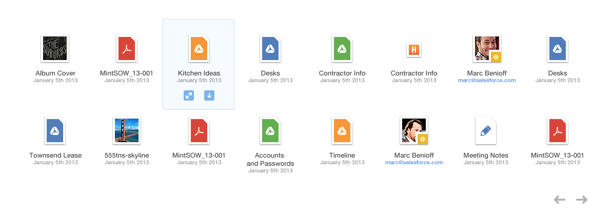
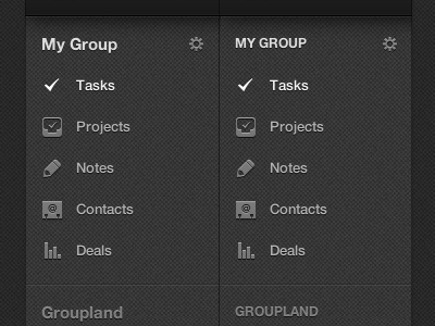
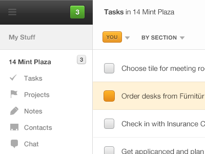
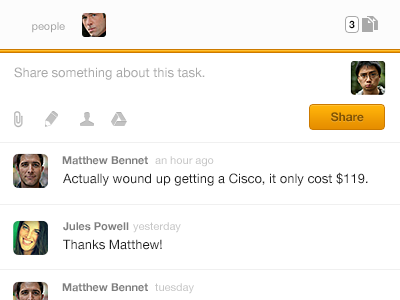
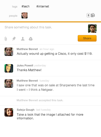
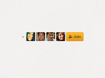
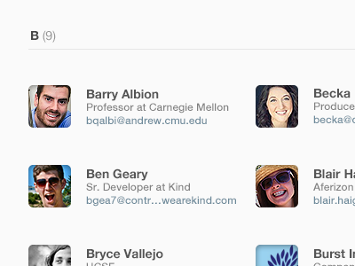
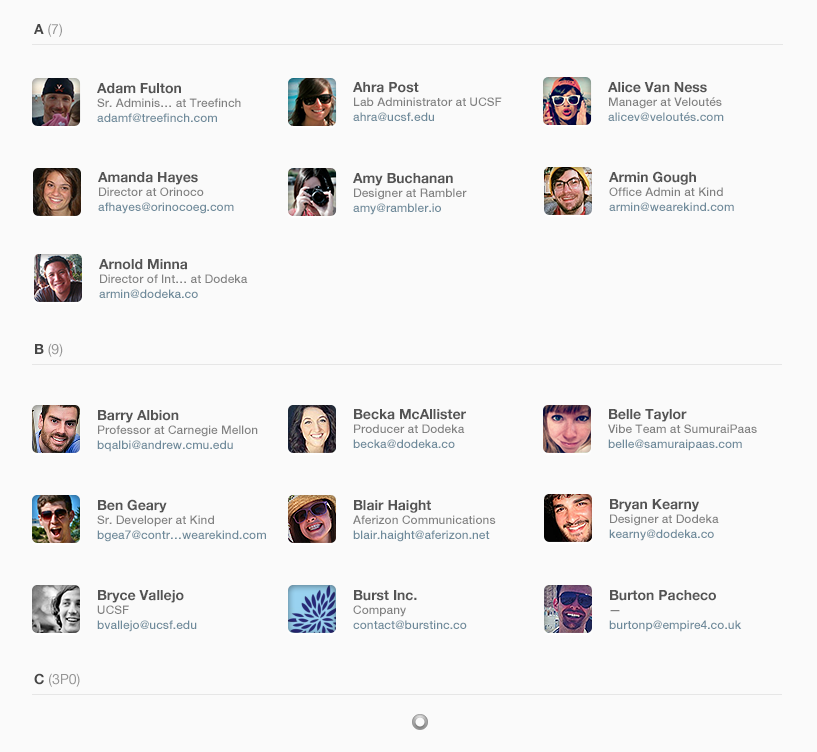
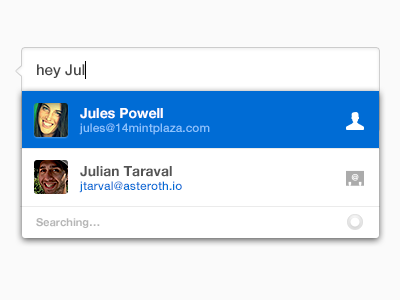
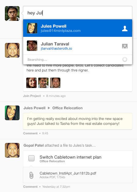
For two years, I lead design a small company in San Francisco with a big mission: to change the way small companies get things done.
Today, Do is done.
The current attachments pane in Do's projects is in need of a major overhaul. @Chanpory's icons for Gmail were great, and I appropriated his colors for the Google Drive attachments we support.
Still working on the overall browser, and ...
• Using orange in more places. Hmm, orange. Orange?
• Trying to minimize the use of depth on UI elements. Only seen on buttons and that poppy divider. Trying that and similar marks as a way of leading the eye through a hierarchy sprea...
Working on the "Mention" UI for Do – it'll wind up being more of a universal way to reference people and objects in posts, and will automatically relate/attach content for you.
Need to work on distinguishing object types I think.
(Lo...