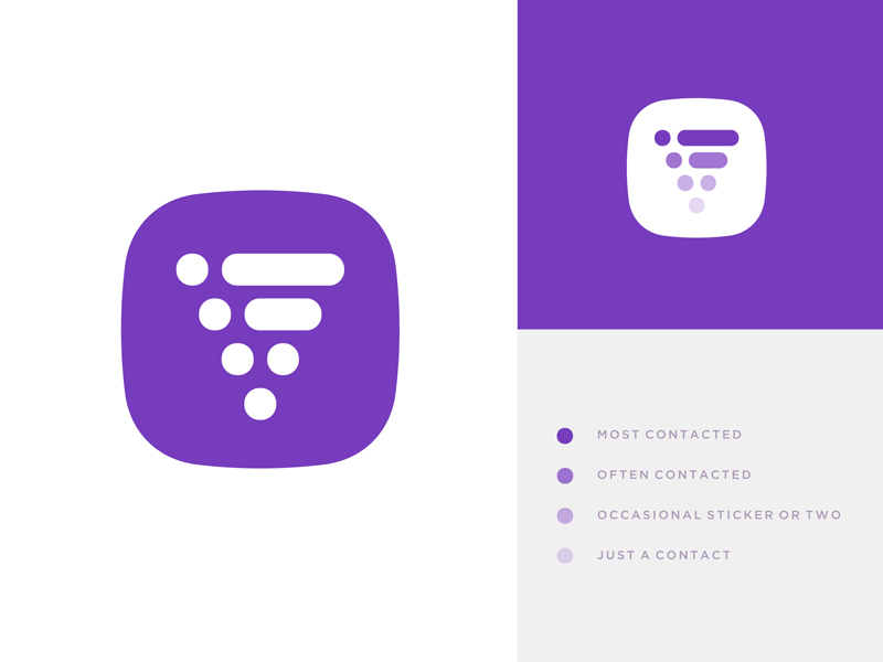
Quick idea I had today on how to redesign the Viber icon. Basic premise is that people rarely use it for phone calls (at least where I'm from) so the obsolete telephone symbol simply doesn't work.
People you communicate with could be s...
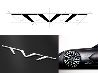
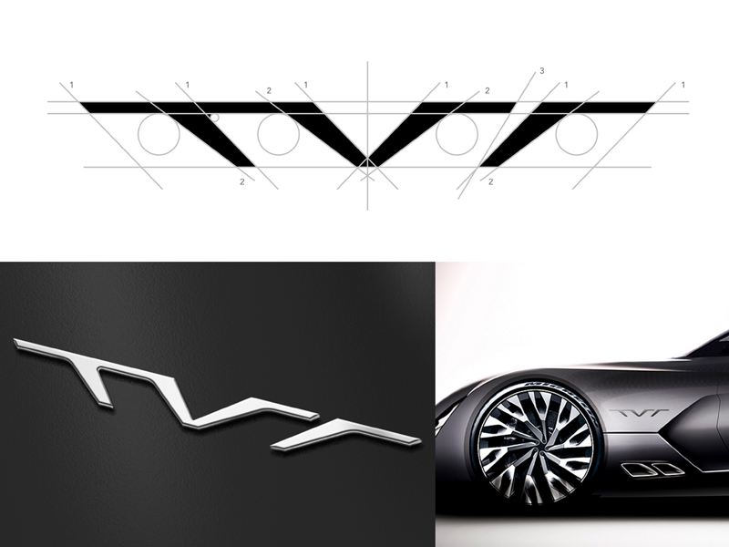
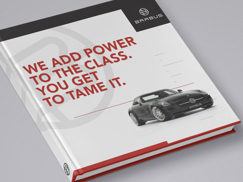
I'm sure that all car aficionados heard the great news about TVR getting back to the scene and preparing new models for 2017. And by the images that leaked those look really hot and fresh, but unfortunately, the look won't be quite well ...
Played with the Memphis Grizz mascot/logo a bit with these goals in mind:
1) hint of the letter M within the head area
2) more prominent eyes
3) overall shape closer to heart shape
4) wilder and more mysterious
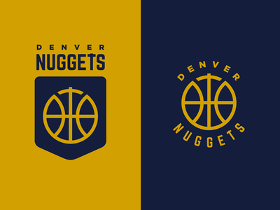
In the spirit of latest "simplification trend" in basketball re-branded identities (Clippers, Hawks, Raptors, Nets) I took a shot on Denver Nuggets (again) and stripped it down to the bone.