Aunt Key's Apothecary Rebrand Logo

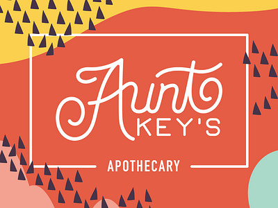

The previous Aunt Key's logo wasn't able to reflect the bright personalities behind the company. Organic shapes and pops of color with a dash of custom lettering was just the unique touch those gals needed to stand apart from the pack!


