PowerLook Dashboard 🚀

Hello, Dribbble Community! 👋
✨Presenting my design for the PowerLook Dashboard, a cutting-edge solution for streamlined security and safety management. This dashboard design aims to provide an intuitive and efficient user experience for professionals in various industries.
🚀 Let's dive in:
🎨 Design Elements:
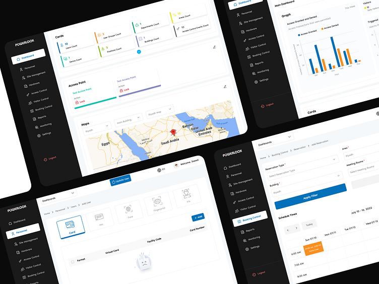
1️⃣ Sleek and Modern Interface: The PowerLook Dashboard features a contemporary and visually appealing interface.
2️⃣ Usability-Focused: The design prioritizes usability, ensuring easy navigation and interaction.
3️⃣ Clean Lines: The interface utilizes clean lines for a clear and organized look.
4️⃣ Bold Typography: Bold typography adds personality and enhances readability.
5️⃣ Harmonious Color Scheme: A carefully selected color palette creates a cohesive and professional aesthetic.
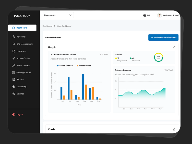
6️⃣Data Visualizations: Charts and graphs simplify complex information for easy comprehension.
🌟 UX (User Experience):
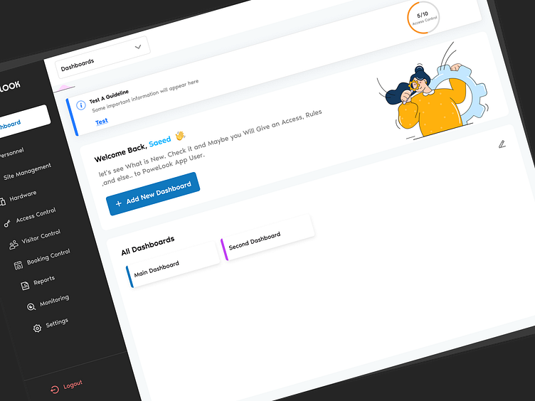
The PowerLook Dashboard prioritizes user-centric design with intuitive navigation, interactive features, and responsive design for a seamless user experience.
↳ User-Centric Approach: The PowerLook Dashboard prioritizes a seamless and intuitive user experience.
↳ Easy Navigation: Users can effortlessly access key features and information.
↳ Interactive Elements: Filters and search functionality enable users to customize their dashboard experience.
↳ Responsive Design: The dashboard performs optimally across devices and screen sizes.
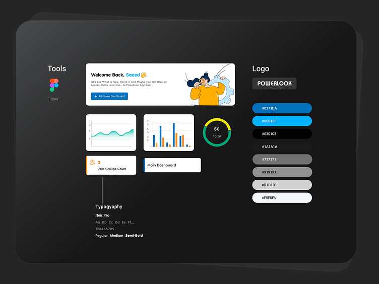
🛠️ Tools Used:
Figma
Thank you for joining our creative journey! 💛
Get in touch:
🌐 Explore all my websites: https://bento.me/randaabuzayed
📬 For business inquiries: randa.abuzayed0@gmail.com
🏆Check out my big projects on Behance
Spread the love ❤️ by hitting the "Like" button or leaving a comment to share your valuable thoughts.
Your support fuels my creativity! Thank you for being a part of my journey! 🌟


