Coin Magnet Crypto App

Coin Magnet is a crypto app for beginners who want to learn, earn and grow their financial portfolio with digital assets.
Goals
The app was to fulfill the following brief:
A simplified crypto currency application
Fewer steps to trading
Less complex stats
Tutorials and information about crypto for beginners
The research part of this project was already done and the objective here was to deliver rich visuals of the actual mobile app.
Design brief Source: Dribbble Product Design Course
My role
I designed the flow, high fidelity screens as well as the prototype.
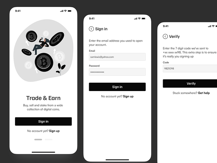
Sign up / sign in
The sign in implements an extra layer of security by requiring authentication to be made by not only adding your email address but also the verification code sent to your phone. For support, a get help link is available. That link would connect you to customer support who will either be an AI bot or …yeah an AI bot before connecting you to a human being. This way, help is always present, costs are kept to a minimal and the human interaction is still available when needed.
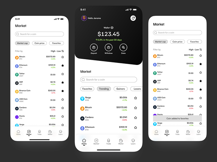
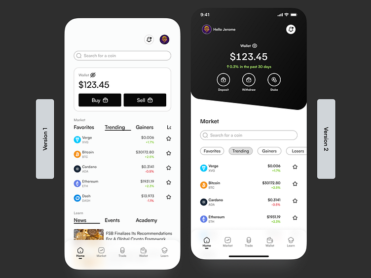
Home screen
The spotlight is on the coins: how they are doing in the market, how much they cost and the provision of adding them to your favorites. As for the layout, I chose a slanted shape as the container for the wallet info. The slant design originates from a distorted credit card to signify the non-traditional state of the crypto market. It’s a market of wild swings with possibility of exponential growth as well as losses.
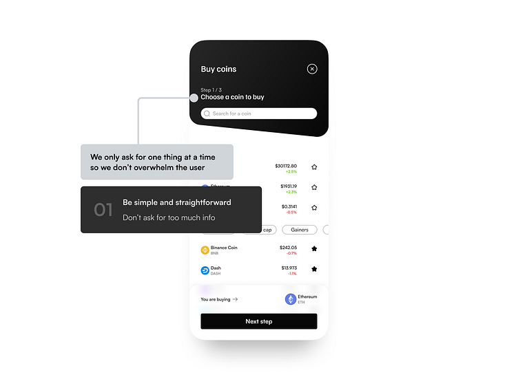
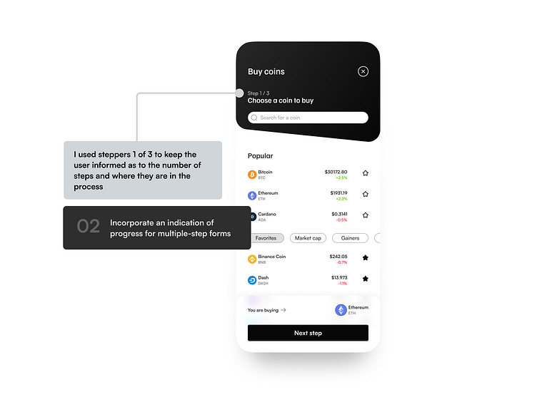
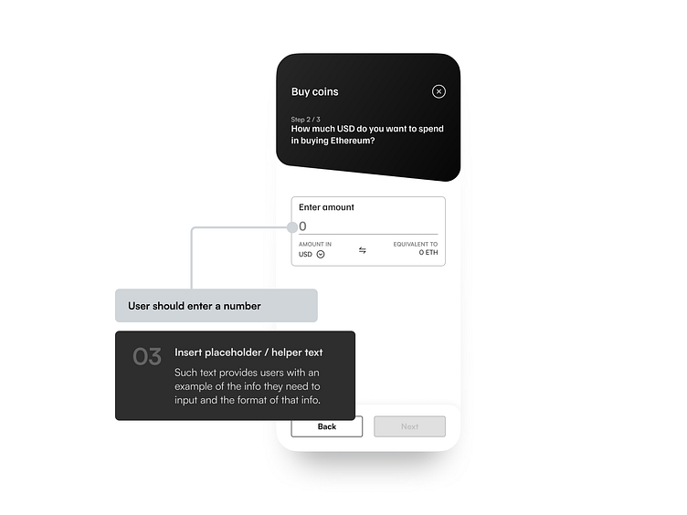
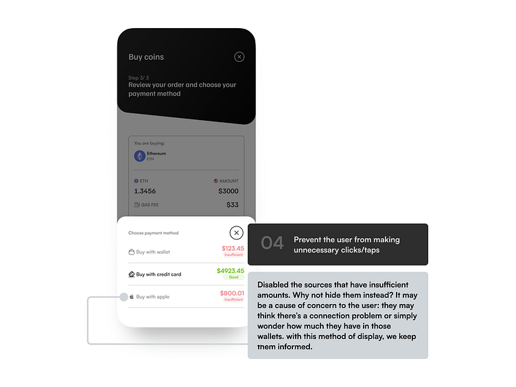
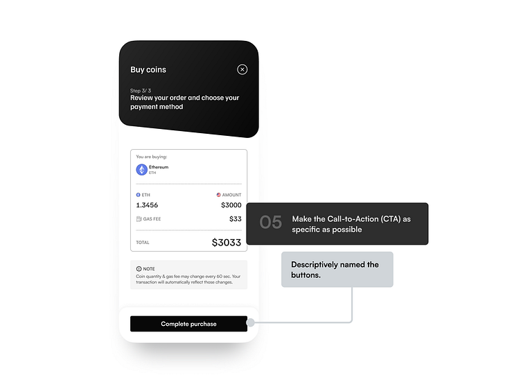
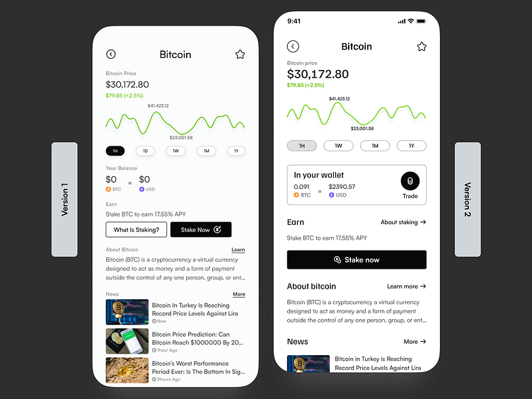
Trading
Using best practices for designing a form, I designed a linear flow for buying an asset.
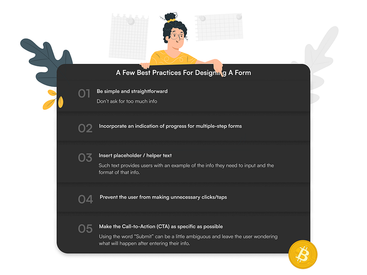
Execution of the best practices
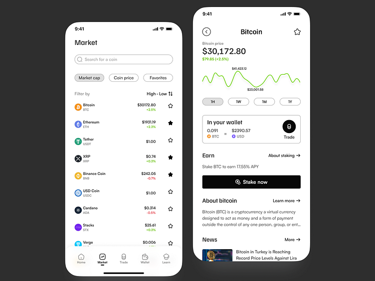
Market
The layout allows you to filter coins by their market share, purchase price or those you’ve saved as your favorites. Going a step further, you can learn more about the coin of choice, trade it and get some news updates on how it’s doing in the crypto world.
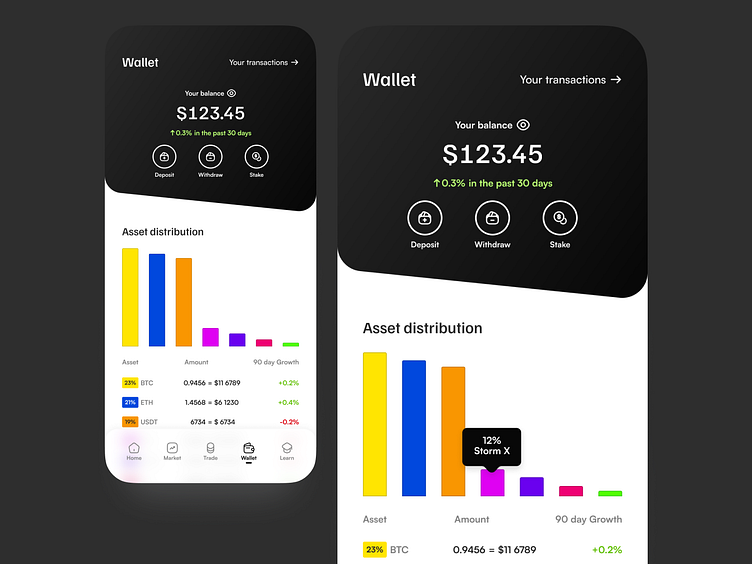
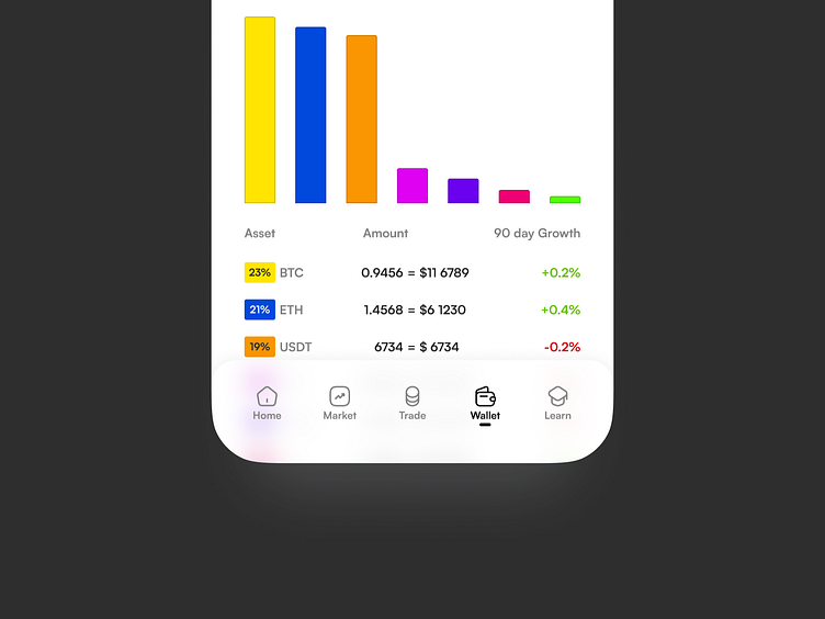
Wallet
A color graph was used to differentiate each asset. Each color block represents an asset and a legend below the graph shows its percentage, amount in crypto and its dollar equivalent.
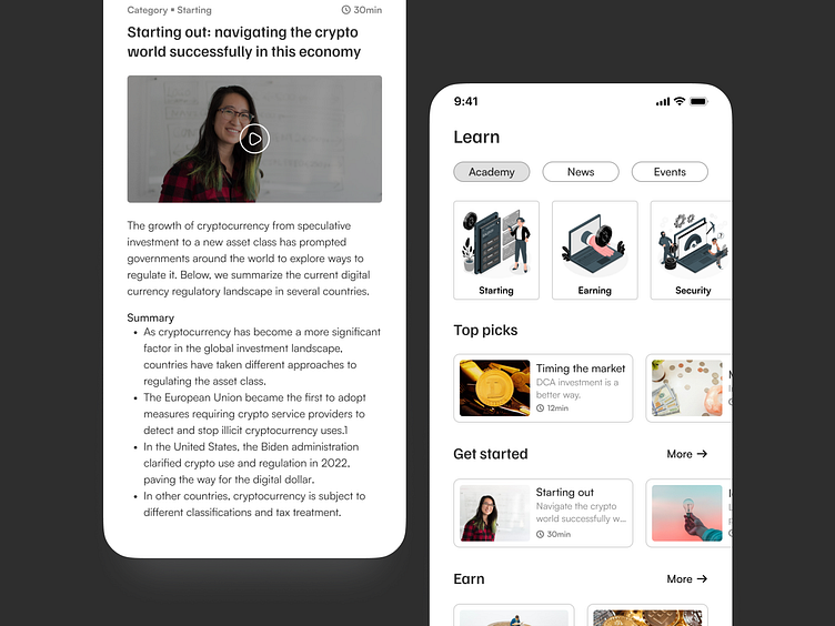
Learn
A space dedicated to educating via tutorials, news and more, all categorized for easier consumption.
Navigation
Simple icons that clearly communicate the actions they represent were used. The goal was to have descriptive enough icons that would not need labels. But because I was after good design, labels were added as part of the navigation. One less thing for the user to think about.
Colors and typography
Colors were kept simple with black and white. The choice was very deliberate as the focus is on beginners. As a beginner, I believe for the most part, when things are kept plain and simple, the chances of grasping concepts quickly and attaining your desired goals are much better.
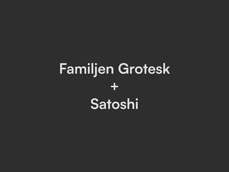
For the typeface, I went a little fancy so as to complement the simplicity in color choices. Headings used an elegant sans serif Familjen Grotesk while the body copy used Satoshi. Both maintain legibility even in small sizes.
Usability testing
Prior to this version, I ran a usability test on the very first version. The goal was to validate my assumptions that the flow was pretty much simple. Unsurprisingly but none the less pleasantly, my assumptions were validated as true. The participants were able to successfully accomplish the key task I gave them which was:
Sign up and browse through the list of coins, find out more about a particular coin and then buy that coin.
More feedback
Shortly after, I reached out to my design mentor for some feedback which resulted in this current version of the app based on some great pointers he gave. It’s important to reach out to someone a level up otherwise you’ll believe in your own hype and end up in a heap of garbage. Ok, a little overboard but you get my point. Let someone else further along the way steer you in the right direction.
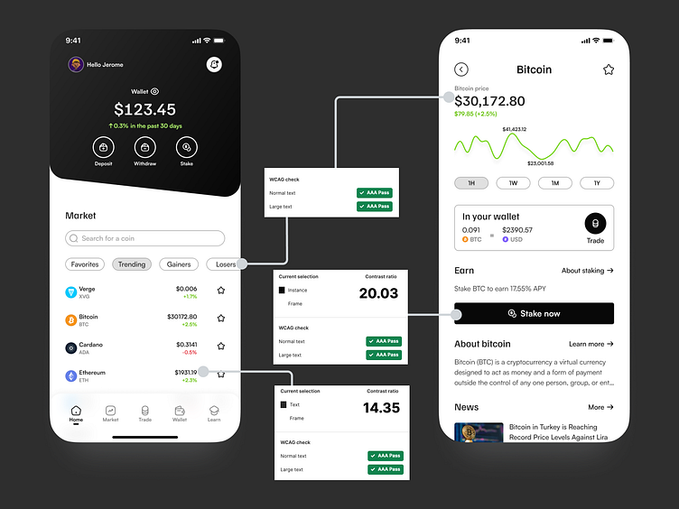
Accessibility
No contrast issues found here.
Takeaway
Designing for this space requires a little more effort than a usual financial app. Why? Crypto trading is still a relatively new space and so a lot has to be done in terms of holding the user’s hand each step of the way until they achieve their goal. The training wheels on this bike stay on a little longer. For instance, we have to keep the user informed of the equivalent amount in dollars (or other fiat currencies) when they want to trade and make the necessary info available contextually e.g. a brief explainer of what gas fees are when they are on the trading screen.
And of course, APIs and security. There’s much more that goes behind the payment flow than what I have shared here. This was simply an exploration of what the happy path would look like. I call it the “good vibes only” path 😊.
All in all, I enjoyed the experience and look forward to further exploration.


