Detail 3.0 App Icon


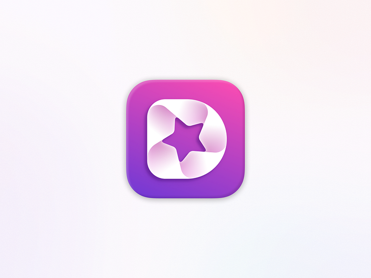
When it came to designing our app icon we really wanted it to communicate that Detail helps you create amazing video. So, we combined the letter "D" with a camera aperture and shaped the aperture like a star as a nod to how Detail puts users at the center of the experience — you can be the star of your very own show.
For our major 3.0 release we made the icon more energetic and upped the color contrast to really make it "pop" 😉.
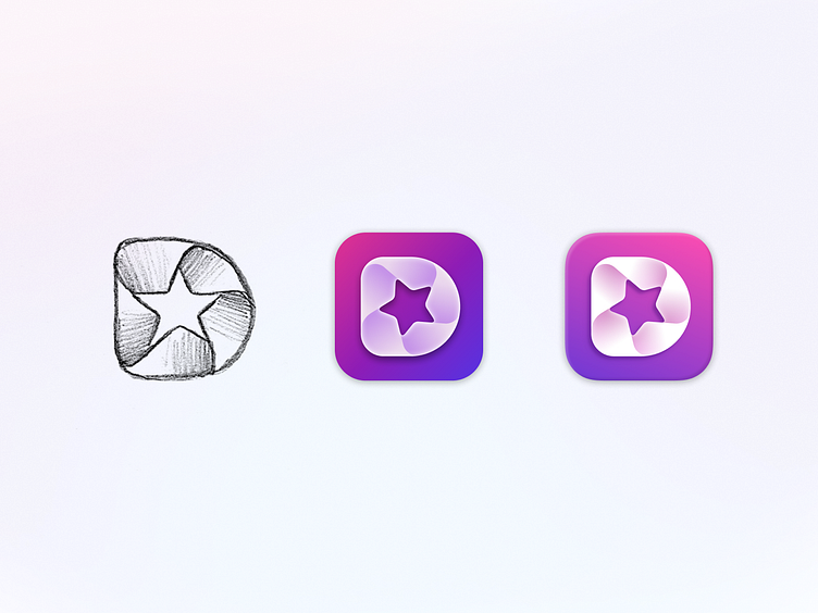
Our icon started off as a simple sketch. The first version was well received and is even featured in the App Icon Book. But design is never done and we're really happy with the latest version.
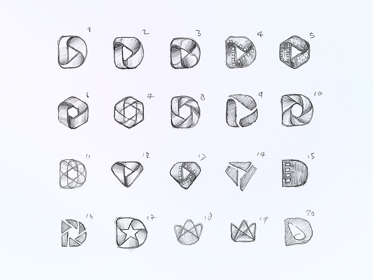
Good designs often starts with a pencil. These are some of the icon concepts we explored on paper.
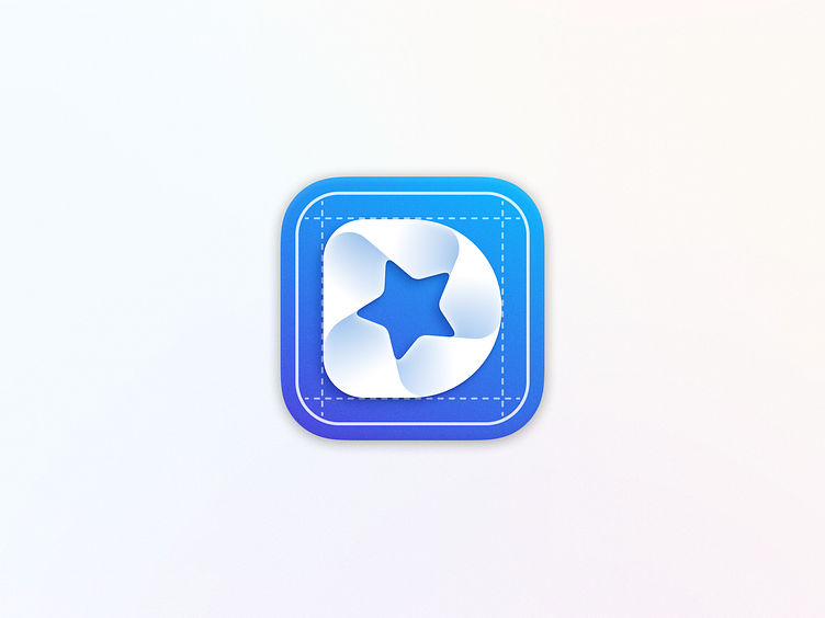
Our engineers requested a blueprint version of the app icon for their builds. Come join us if you'd like to use it too. 😄


