J.R. Donaldson Marks + Typography

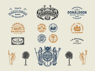

Typography, illustration, and marks exploration for a well traveled gent and gin distiller. Inspired by 19th century travel stamps, seals, and type - the goal was to achieve a classic aesthetic for the client's personal branding and stationery.


