Ameridian Pacific College Rebrand + Website Design


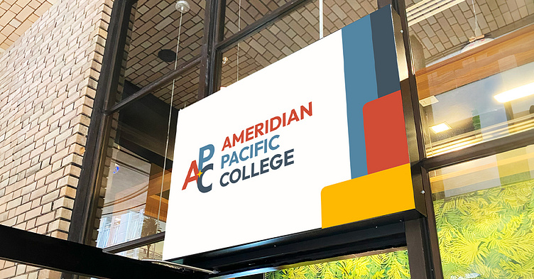
The original logo was dated and busy. It had a good concept to it (navigating the world of education), but was out of touch with the digital world. I stripped it back to a simple symbol mixed with a clean sans serif. The APC symbol features a North Star to maintain a directional concept but the symbol is strong and stands on it's own for social media, merchandise, branded materials etc... It was a very fun project and I love how it turned out.