02/32 – Washington Knights

The Men of Steel
The Washington Knights are the second team we're sharing for #TheUFLProject.
The Knights have only been to one Championship Game (Season 2) – a game in which they lost. Since then, the Knights have consistently been a middle-of-the-pack team without many highs or lows. Only recently has the team been able to load up on some picks to acquire some talent. They play in the Metropolitan Division of the East Conference.
Visual Direction
A knight, in the medieval sense, is a skilled warrior entrusted by the head of state to represent its country in battle. With this franchise being located in the nation’s capitol, the name “Knights” was a natural fit for the Washington franchise.
While in a figurative sense a knight will represent their nation in battle, they will from a literal sense too – heraldry was a vital distinguishable element often depicted on shields as well as banners to establish presence and demonstrate power. The Washington Knights, proudly playing in the Nation’s Capitol, adopt this thematic and implement it throughout the entire visual identity.
Execution
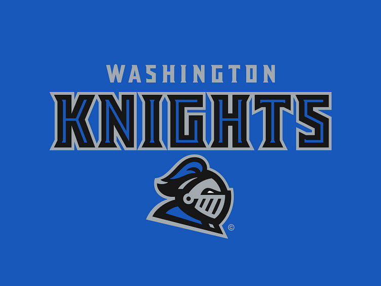
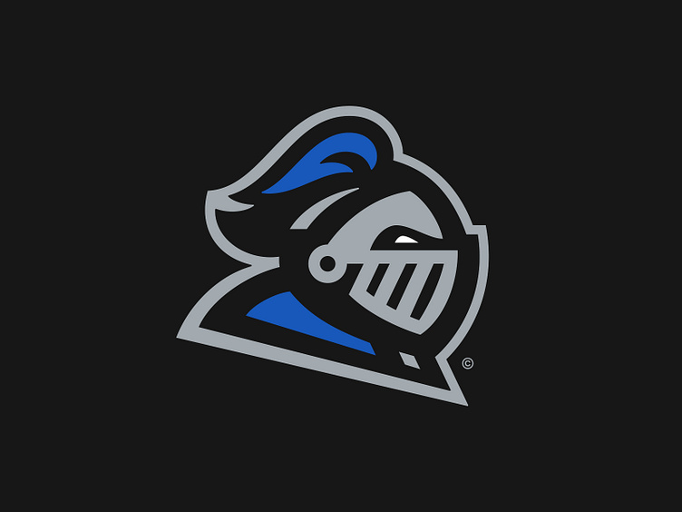
The primary logo depicts a knight helmet in profile with a royal blue surcoat and helmet plumage. The new orientation of the helmet ensures that the knight always charges as the player charges, with all of the energy moving towards the facemask. (While other executions in different profiles had a nice aesthetic on paper, they did not execute as well.)
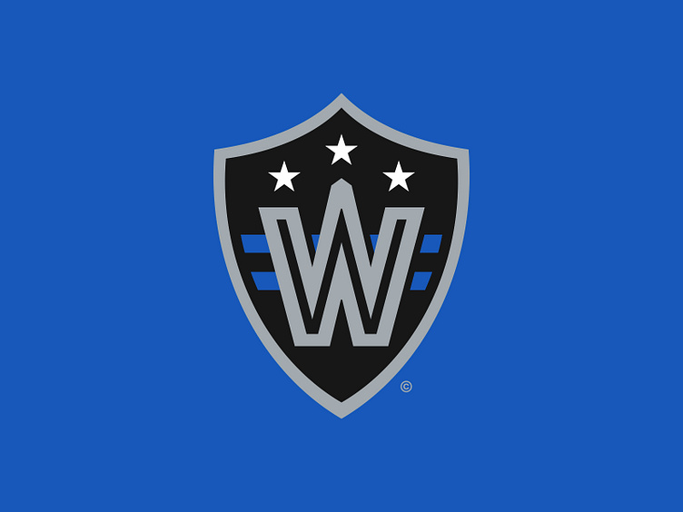
The logo in the secondary spot leans in to the heraldic motif – a heater-shaped shield with elements from the flag of D.C. behind a strong "W" with a subtle nod to the Washington Monument in the center.
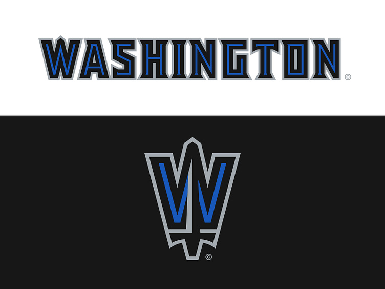
The third logo (we're calling it the Partial Logo), extracts the “W” from the shield and builds a sword in to it while maintaining the same subtleties to the monument.
For the typography, we dusted off an inline style that was used early on in the team’s visual history that was inspired by the grates of a knight’s facemask. We revised the structure of the typography to feel bolder and sturdier and applied a royal blue inline throughout.
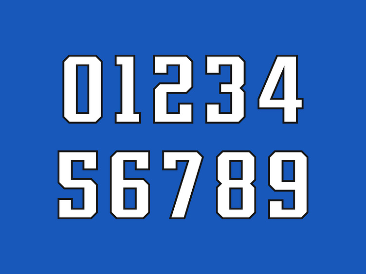
The jersey number set has largely remained unchanged throughout the team’s history. It follows a traditional athletic block aesthetic but with increased contrast – not unlike the New England Patriots or Tennessee Titans number sets of the 2000s.
Unearthing the Shine
This revitalized brand identity for the Washington Knights looks at the team’s visual history and applies a more robust theme of heraldry and knighthood to tie the name to its location in a bold graphic package that is sure to give this old team its shine back.
Football Helmet Mockup by SportsTemplates
____________________


