Case Study: Iomtnetic – Logo and Pitch Deck Design


Case Study: Iomtnetic – Logo and Pitch Deck Design
CLIENT
Iomtnetic
DELIVERABLES
Logo Design – Neda
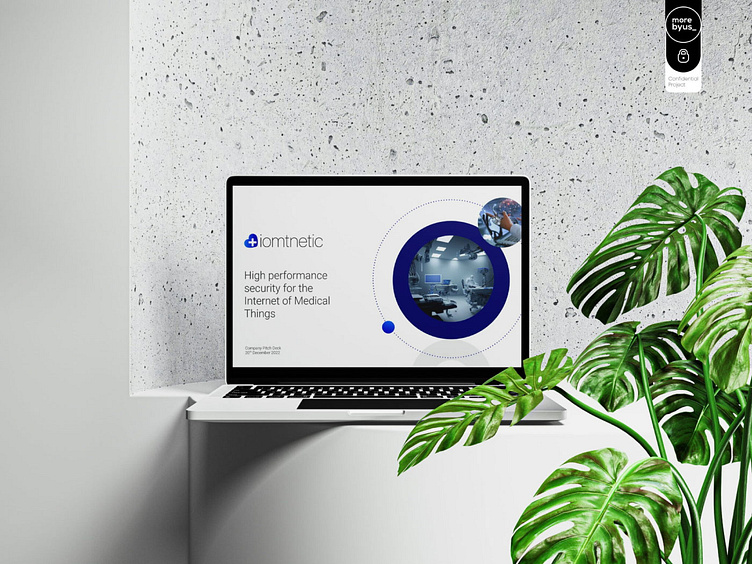
Pitch Deck Design – Mimy
ABOUT Iomtnetic
The company focus on developing platforms that allow healthcare providers to collect and analyze data from medical devices, and provide actionable insights that can improve patient outcomes. These platforms use advanced analytics and predictive modeling to identify patterns and trends in patient data, and provide security.

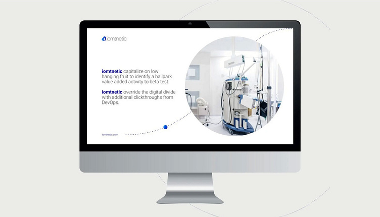
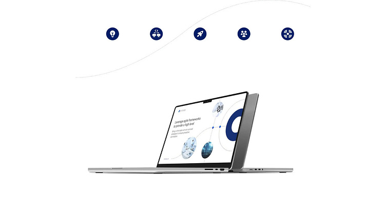
ABOUT THE PROJECT
Our goal was to create for iomtnetic visually appealing, informative, and engaging presentation, with a clear focus on the unique value proposition of the company’s product. We focused on: – clear and attention-grabbing headline that conveys the core message of the presentation;
– use high-quality visuals, such as images, infographics, and charts, to illustrate key concepts and data points;
– visuals relevant to the content and help to reinforce the message of the presentation;
– a consistent color scheme and typography to create a cohesive look and feel;
– customer product examples to demonstrate the real-world impact of the company’s product;
– data and statistics to support the company’s claims and demonstrate its expertise in the field.

"
It’s not just about being better. It’s about being different. You need to give people a reason to choose your business.
Bill Gates
____________________________________________________________________________________

THE COLOR PALETTE
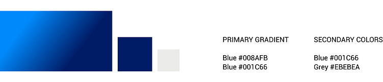
When choosing a color palette for the presentation design, we considered the values and goals of the company, as well as the nature of the industry.
Blue: Blue is a calming color that is often associated with trust, reliability, and intelligence. It can be a good choice for an IoMT company, which is focused on healthcare security and requires a high level of trust and reliability from its customers.
White: White is a neutral color that we used to create a clean, modern, and professional look.
Grey: A versatile color that we used for a sophisticated and elegant look.
THE LOGO
We wanted to design a logo for Iomtnetic with the best symbols that communicate the company’s mission and values while being visually appealing and memorable. The key elements incorporated into the logo are:
Cross Mark and a Heart. These symbols communicate that the company is involved in the healthcare industry and focused on improving patient outcomes with a certain level of personality.
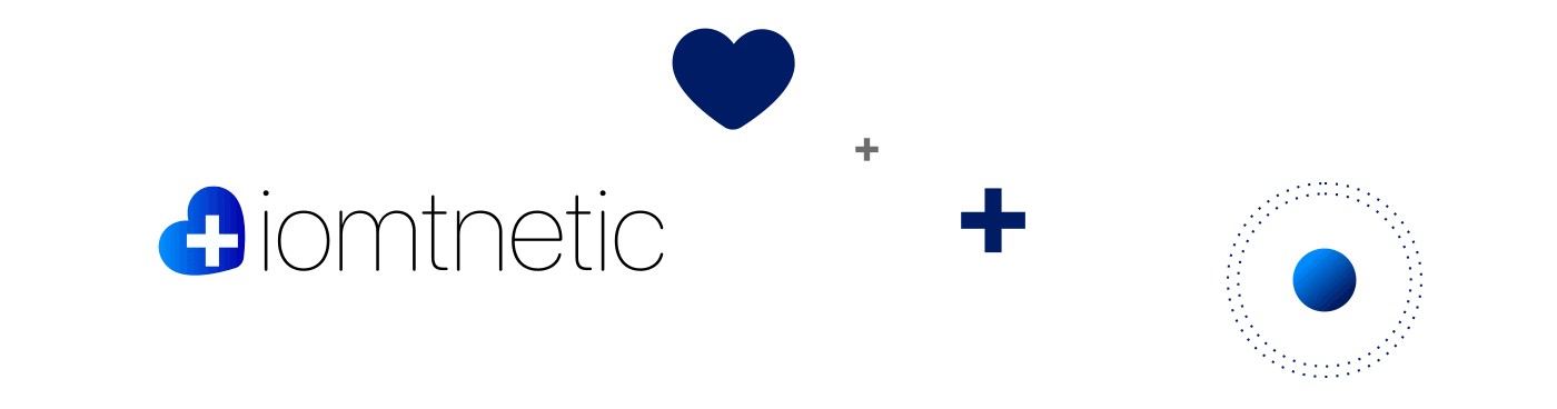
The Iomtnetic logo have a clean and modern design. It is visually appealing and easily recognizable, even when scaled down to small sizes. The logo involves the intersection of healthcare and technology. This communicates the company’s focus on innovation and cutting-edge technology.
THE ICONS
We designed a set of visually appealing and easy-to-understand icons, while also accurately representing the product. Icons are simple and easy to recognize. Avoiding using too much detail or unnecessary complexity we made them easy to perceive at a glance.
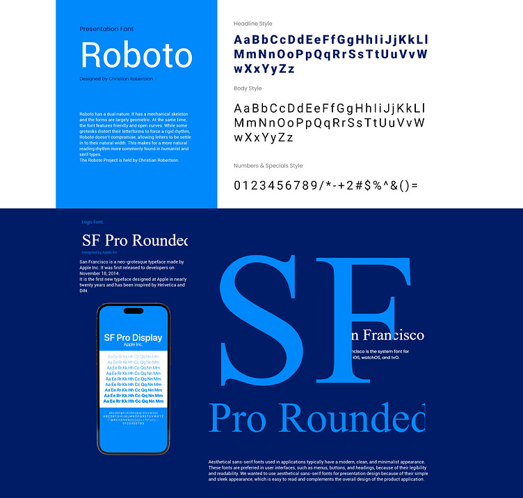
THE TYPOGRAPHY